|
11.7 Correcting
Color, Saturation, and Tilt
In this section we’ll very briefly
consider three image attributes that occasionally require some
correction in post-process. The first is the issue of tilt.
When shooting birds that are either perching on the
ground or are wading in the water, it is usually important to make sure
that your camera is level to
the horizon—that is, that it’s not tilted slightly. For birds in
flight or perched on branches it’s usually less critical, since the
viewer usually can’t tell how the horizon lines up with the image
anyway. But for birds on land or in water, any more than the
slightest tilt can be obvious to the discerning viewer. In some
cases, such a tilt may convey an artistic slant to the image (no pun
intended). In others, you’ll want to correct the tilt.
The good news is that correcting tilt in Adobe Camera Raw (ACR) is quick and
easy. Simply select the Straighten
Tool from the tool palette, and then drag a line (with the
mouse) along any horizontal feature that you can find in the
image. The figure below illustrates this.
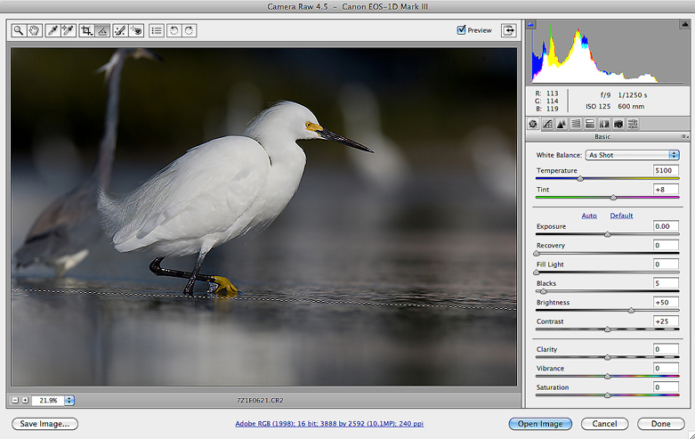
Fig. 11.7.1:
Correcting tilt in Adobe Camera Raw. Select
the Straighten tool and then simply drag a line along a slice
of the image that should be horizontal. This is easiest in the
case of shallow depth-of-field, as illustrated here.
In the figure above, we’ve dragged
a dotted line (using the Straighten
tool) along the shallow in-focus region in the water. This
indicates to ACR that the image should be rotated so that the dotted
line becomes perfectly horizontal in the resulting image. In this
case, choosing a feature to serve as a guide for the tilt line was
simple, because of the shallow depth-of-field (DOF). In other
cases it can be more difficult. For example, when photographing
waterbirds in a small body of water, you may be tempted to use the line
of the far shore as the guide; this may or may not be a reliable guide,
however, depending on whether the far shoreline is perpendicular to
your line of sight. Likewise, for birds on land you need to be
careful not to simply use the horizon as the guide, since the horizon
itself may not be level (e.g., in the case of a hill). A general
rule-of-thumb is to try to select a tilt line that traces features of
the image that are all the same
distance from the camera. In the case of a shallow DOF (as
in the figure above), this will be simple; for a wider DOF, you may
need to look more carefully at the image and try to discern the
topology of the landscape.
The figure below shows what happens in ACR when you
release the mouse cursor after drawing the tilt line. ACR clips
the corners of the image so as to form a rectangle that is
parallel/normal to the tilt line. And so, here we have the bad
news: while correcting tilt is quick and easy in ACR, it results in a
reduction in image size, because some corners need to be clipped in
order to perform the rotation and still end up with a properly oriented
rectangular image.
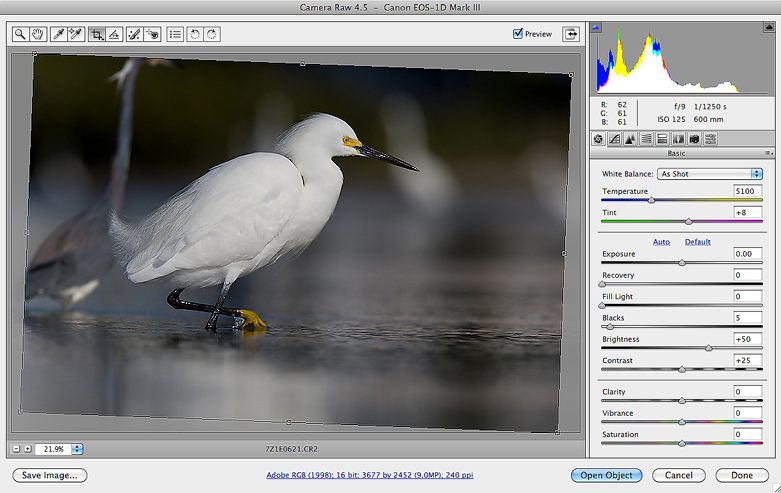
Fig. 11.7.2:
Fixing tilt has its price: the loss of pixels
around the margin and in corners. The larger the
tilt, the more pixels you’ll lose. So try to keep your
camera level in the field!
In cases of only slight tilt, the
resulting reduction in image dimensions may be acceptable. Larger
corrections require larger reductions in image size. Depending on
where the subject is located in the original image, it may or may not
end up too close (aesthetically) to the edge of the photo in the
resulting, corrected image. For this reason, when shooting in the
field it’s sometimes worthwhile to keep the subject closer to the
center of the frame than you might otherwise like. Though your
artistic instincts may tell you to position the bird away from the
center of the image (for compositional purposes), if you know that you
have a tendency to tilt your camera away from the horizontal and that
the scene’s natural features will betray that tilt to your viewer, you
may want to err on the side of having the bird closer toward the center
of the image so that after tilt correction in ACR you won’t end up with
the bird appearing unnaturally close to the (clipped) edge of the frame.
The image below shows the result of using the
Straighten tool on our working image. Note that the shallow
in-focus region now appears level, rather than sloped.
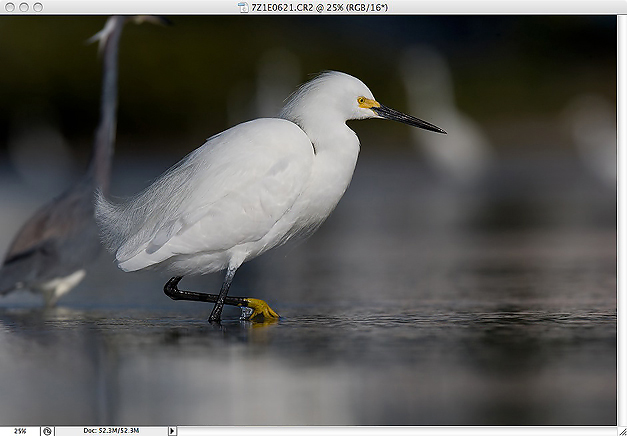
Fig. 11.7.3: The image from the previous figure, after fixing tilt.
The shallow in-focus region is now more level. Note that you
don’t always need to fix tilt; if it looks fine to you, consider just
leaving it as-is. A tilt can sometimes even enhance a scene by
lending it a modern, hollywood-like effect.
Note that you can also correct tilt in Photoshop proper (rather than
ACR) via the Image > Rotate
Canvas > Arbitrary menu option. This is useful if you
realize you have a tilt problem only after you've already converted
from RAW and invested time in various other postprocessing
operations. The downside is that rotation via Rotate Canvas in Photoshop is a
tedious, trial-and-error process, because you have to guess at the
angle of rotation. An alternative is to duplicate the image to a
new layer (via Cmd-J / Ctrl-J),
activate the Move Tool (by
pressing the V key), and then grab the corner of the image with the
mouse cursor and rotate free-hand. The image should immediately
rotate in real-time, so you can continue rotating until it appears
level to you.
The next issue we’d like to briefly discuss is color correction. When using
high-fidelity cameras and lenses, color correction is rarely needed for
outdoor photography, in my opinion, since color casts in nature photos
are often a reflection of the natural quality of light that was present
at the time and place that the photo was taken. Late in the day,
for example, light often takes a reddish hue, due to the physics of
light in the context of a setting sun. Attempts to “correct” this reddish hue not only run
counter to the nature of the actual scene photographed, but also tend
to introduce artifacts that to some viewers may appear unnatural.
Nevertheless, there are cases in which nature
photographs can benefit from some very subtle color correction—and in special cases (primarily sunsets) even extreme correction.
There are several tools in Photoshop and Adobe Camera Raw that can aid
in this. In ACR, there are the Temperature,
Tint, Saturation, and Vibrance sliders in the main
control panel. The figure below shows the controls in their
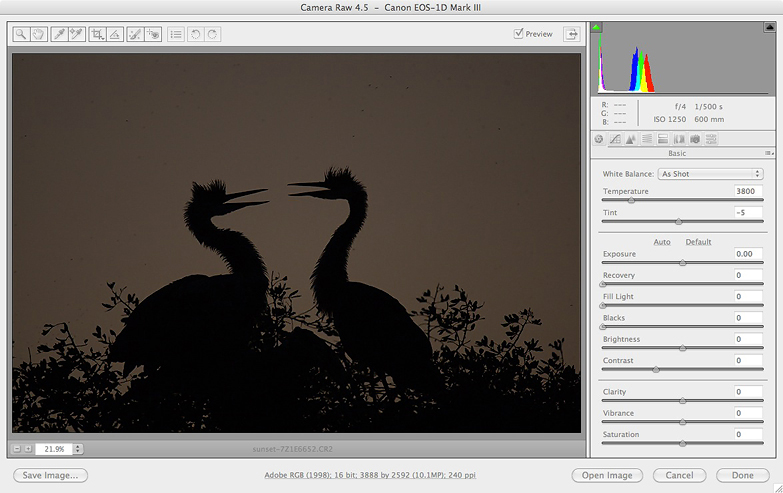
default settings, for a rather drab sunset shot of two herons at the
famed Venice Rookery in
Florida.
Fig. 11.7.4:
Adobe Camera Raw provides several sliders for adjusting the
overall color and saturation, including Saturation, Vibrance,
Temperature,
and Tint. After RAW conversion, you can further adjust the color
using tools
in Photoshop proper (not shown here). Notice in this figure that
the color
components of the histogram are lumped together in one place.
Notice in the above image that the
red, blue, green, and yellow components of the image’s histogram are
largely coincident (i.e., piled on top of each other). Now look
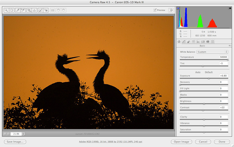
at the next figure (below) and its histogram. In this case we’ve
moved the Temperature slider
to its maximum value, which has resulted in a drastic separation of the
histogram components, with the larger red component now far to the
right and the blue components now further to the left. (The Contrast slider has also been
adjusted to increase brightness in the sky while leaving the
silhouettes black). The scene now looks more like a sunset.
Fig. 11.7.5:
The same image shown in the previous figure, after adjusting Temperature
and Contrast in Adobe Camera Raw. Notice how the color components
of the histogram
have been separated, with a large red component dominating the brighter
end of the distribution.
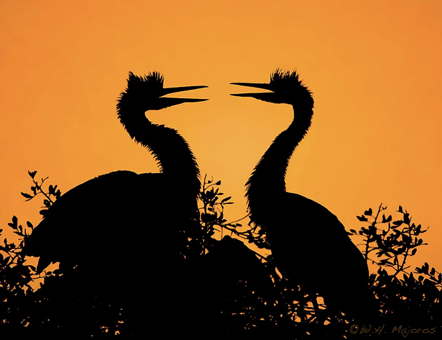
Futher manipulations of the
brightness, saturation, and contrast in Photoshop proper (via the Levels tool and the Saturation tool) then sufficed to
create a more striking final image, as shown in the figure below.
(Note that the Straighten
tool in ACR was again used to straighten the image, this time based on
the relative orientations of the bird’s upper bodies, rather than on
the substrate).
Fig. 11.7.6:
The image from the previous figure, after adjusting brightness via
Levels in Photoshop (and after eliminating tilt and adding a signature).
Note that while
saturation can be adjusted directly via the Saturation or Vibrance sliders in ACR, or via the
Hue/Saturation
tool in Photoshop, there are other ways to adjust saturation which
sometimes yield more desirable effects—whether more subtle or bold than
is possible with the direct Saturation
tools, or simply more controllable in the context of the image being
processed. In particular, any operation which adjusts the
brightness or contrast of the image can affect the perceived
saturation. In the figure below, we use the Levels tool to adjust brightness
and contrast by moving the black point to the right and the white point
to the left. Note that the resulting image (the bottom pane in
the figure) has richer colors, suggestion greater saturation, even
though the Saturation tool
was not touched.
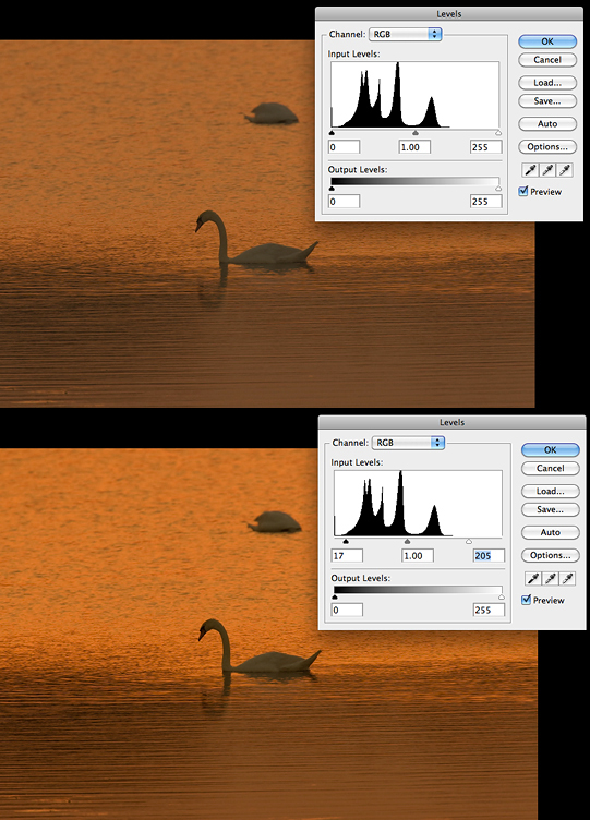
Fig. 11.7.7:
Color and saturation can also be manipulated using
the standard exposure tools such as Levels and Curves. In this
example, increasing the contrast has resulted in richer colors.
As already mentioned in section 10.4, this
effect of brightness
parameters on the perceived saturation can sometimes be detrimental
when you want to adjust brightness or contrast without changing the
overall saturation. In a great many cases you’ll find that after
adjusting the brightness and/or contast of an image, you’ll then need
to use the Saturation tool to
restore the original saturation level. After adjusting the
overall exposure of an image in Photoshop I’ll often open the Saturation tool and decrease the
saturation by -5 or so.
A separate issue from saturation is that of hue, or tint. Whereas saturation has
to do with the intensity of
color in an image, the hue or tint has to due with the identity of colors.
Adjustments to hue/tint are only required when you perceive an
unnatural color cast in your
image. The figure below illustrates this: the bird on the left
has had its hue adjusted by -5, which moves the overall color profile
toward the red/purple end of the spectrum, while the right image has
had its hue adjusted by +5, shifting the color profile toward
green/blue. Notice that the background in the left image has more
red than in the right image, whereas in the left image the bird’s cere (the fleshy area anterior to
the eye) has a slight greenish cast as compared to the image on the
left.
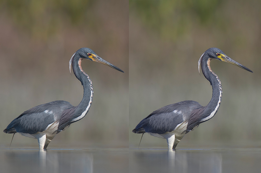
Fig. 11.7.8:
Adjusting hue in Photoshop. Left: setting hue to -5 results in a
slight
shift toward red/purple (noticable in the background of this
image). Right: setting
hue to +5 results in a slight shift toward green/blue (noticable in the
bird’s cere
in this image).
The hue/tint can be adjusted
either in ACR or in Photoshop proper (or both). I rarely find a
need to do either. As mentioned previously, you should be
cautious about using these controls to adjust color casts that are
natural (e.g., due to environmental lighting conditions and/or color
temperature of natural sunlight, such as at dusk, etc.). A better
justification for adjusting the hue/tint is if your equipment imparts
an unnatural color cast to your images. Some third-party lenses,
for example, impart a slight yellow cast to images, due to their
antireflective coatings (see section 3.6 for an
extended example
demonstrating such a yellow cast from an 800mm Sigma lens).
Correcting these types of subtle issues can usually be done with a
very, very slight adjustment to the hue
slider in Photoshop or the tint
or temperature sliders in
ACR. Another case for making such adjustments is if you find that
the color of your photographic prints doesn’t match the color you see
on-screen—an indication of a calibration
error in your monitor’s color profile (see section 14.1).
|
|
|