Chapter
8
Field
Techniques
In this chapter we’ll
go beyond
the technological aspects of camera and flash operation (covered in the
preceding two chapters) and focus on some of the more practical issues
related to shooting in the field. We’ll cover composition principles (i.e., where
you place the bird within the frame), the capturing of interesting
poses, and how to use angles and lighting to your advantage.
We’ll also consider some of the more “physical” aspects of field work, including
how to get close to your subject, how to keep the camera steady while
tracking the bird, and how to deal with difficult situations such as
rain and mud.
8.1 General
Composition Principles
Photographers—even those who
photograph things other than birds—often talk about “composing” an image. Such language
implies, of course, that components of an image can, in some manner, be
assembled at will into a pleasing whole. In the controlled
setting of a portrait photographer’s private studio, this may well be a
viable proposition. In the field, however, with the bird making
its own decisions about whether or not it will assume a pleasing pose
in front of one background or another, the notion of “composing the image” may seem a bit ridiculous.
Nevertheless, there’s typically quite a lot you can
do to influence the overall composition of an impending
exposure—perhaps a lot more than you realize. We’ll start with
the position of the bird in the frame—something you can often dictate
very simply by changing the imaging angle a few tenths of a degree in
the horizontal or vertical directions. By slightly changing the
position of the bird in the frame, you can drastically alter the
viewer’s impression of the world
that the bird lives in. Keep in mind that a person seeing
your photo for the first time likely knows little or nothing about the
precise environment in which that bird was photographed. What
you’re showing him or her is a tiny window on the bird’s world.
From that tiny window he or she then has to imagine what else that
world contains. How you craft the contents of that window can
drastically affect how that viewer’s imaginings proceed from
there. That’s the power of creative photography.
These types of considerations have long been at the
forefront of artists’ minds—indeed, far longer than photography has
existed as an art form. Many great minds have considered the
problem of artistic composition—whether in oils, inks, or other
media—and a handful of useful “rules of thumb” have emerged which can help the
novice to gain a head start on producing more inspirational images.
The most well-known of these guidelines is the
so-called rule of thirds.
While this very crude heuristic has definite merit as a pedagogic
device, we’ll see at length that it has some clear limitations.
Nevertheless, it’ll be worthwhile to spend some time exploring the
applicability of this “rule”.
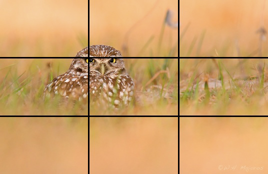
Consider the burrowing owl photo below. The
frame has been partitioned into nine equal areas, by dividing both the
horizontal and vertical axes into thirds.
Fig. 8.1.1 :
The rule of thirds. After partitioning the horizontal and
vertical axes
into thirds, the rule of thirds states that you should try to orient
important
components of the scene so as to lie along a division line, or to fall
on an
intersection of two division lines (a so-called “power point”).
Just keep in
mind that it’s only a rule of thumb—and that no rule in art is
inviolate.
The idea behind the rule of thirds is that major compositional features
of an image should, to the extent possible, align with the imaginary
vertical or horizontal lines that divide the image’s axes into thirds. The
intersections of these lines are known as power points, and are preferred
locations for important subject features. In the case of birds,
at a very course level we might try to align the bird’s vertical body
axis with one of the two vertical lines. In the image above, I’ve
managed to frame the bird in such a way that the bird’s eye almost
perfectly coincides with one of the “power points” (intersection of two guide
lines).
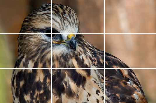
The hawk image below similarly aligns the bird’s eye
with one of the four power points:
Fig. 8.1.2 :
Positioning the bird’s eye on a power point. When the bird
fills this much of the frame, basic constraints such as having a margin
around the bird and giving the bird some space to gaze into can trump
more idealistic considerations.
Note from these two examples that
birds at different distances will generally fill different proportions
of the imaging frame, and that this has implications for the relative
positioning of both major body axes and detailed body features (such as
the eyes, which are typically the most important part of the bird, in
terms of visual and psychological impact). Although it may be
satisfyingly simple
to propose that all birds’ eyes should be positioned at one of the
so-called “power points” implied by the rule of thirds,
the stubborn truth is that the rest of the bird’s body typically
imposes constraints on the image composition that, while often of
lesser rank than that of the positioning of the bird’s eye in frame,
still influence the overall notion of compositional “optimality”. (There’s also the question of just how “powerful” these power points really
are. We’ll get to that later.)
The image below illustrates some of these
issues. Though the eye has been placed some distance from the
nearest power point, the bird’s vertical axis is roughly co-axial with
a vertical division line. Note that the bird is also roughly
bounded above and below by the two horizontal division lines.
Whether this is significant is subject to interpretation. The
greenery is largely confined to the top center rectangle and the bottom
center rectangle, lending some more symmetry to the image. The
fact that the branch’s endpoints don’t both coincide with a division
line works against the overall symmetry somewhat, but composing an
image almost always involves some sort of compromise. Personally,
I think I could have shifted the entire image slightly to the right.
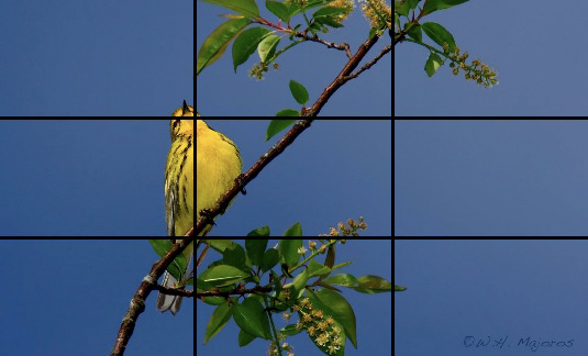
Fig. 8.1.3 :
The rule of thirds may apply in a number of ways.
This bird’s height is roughly one-third of the frame, the greenery
fits (almost) into two of the nine cells, and the bird’s vertical
axis aligns fairly well with one of the division lines. The main
branch doesn’t entirely conform, however.
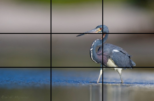
Let’s move on to the tricolored heron below.
The central axis of the bird’s anterior half does seem to align fairly well
with the vertical guide line, and the axis of the head and beak do seem
to average to a conformation nicely intersecting the upper horizontal
guide line. The eye almost falls on a power point. What I
like about this image—forgetting about the division lines for now—is
that the bird has a lot of space on the left to look at, and to move
into if it so chooses. That is, the bird’s world—as imagined by
the viewer of the image—contains enough space, in the direction that
the bird is facing, to possibly account for the bird’s attention being
focused where it is.
Fig. 8.1.4 :
Axes and spacing. Though the bird’s main axis seems fairly
well aligned with one of the division lines, the overall spacing around
the
bird seems more significant in this image. The bird has a
comfortable
margin above, below, and to its right, while the direction in which it’s
gazing is wide open, leaving more to the imagination.
Notice also in this image that the
water seems to asymptote
toward the lower horizontal line. The bird has a roughly equal
amount of space above and below it. Although it has plenty of
space to its left to contemplate, the bird isn’t right up against the
edge of the image on the other side.
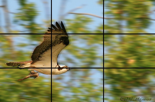
Now on to the osprey below. The bird’s
horizontal axis lines up nicely with the lower guide line, and the
vertical axis of the wing lines up with the vertical guide line.
As with the previous image, there’s an equal amount of space above and
below the bird, and there’s at least some margin (albeit a small one)
behind the bird. I think this bird would look fine slightly
forward of its current position, but I think the framing shown as it is
could be more dramatic for large prints (20×30 inches or larger); for smaller
prints (8×10 or 11×14) I may indeed prefer to move
the bird foward a bit in the frame.
Fig. 8.1.5 :
Birds in flight need some place to fly to. Though this bird’s
horizontal
and vertical axes conform well with the rule of thirds, the eye does
not fall on a
power point. More important in this case is that no part of the
bird touches the
edge of the frame, while the bird has plenty of space in front of it,
leaving
the viewer room to imagine the bird’s trajectory and destination.
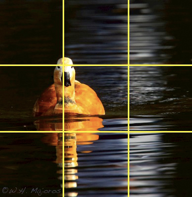
Moving on to the ruddy shelduck below, we see
that the bird’s vertical axis is almost perfectly aligned to the
vertical guide line on the left. In addition, the head falls
directly on a power point. The moonlight reflecting in the water
has a central axis that doesn’t quite coincide with the other vertical
guide line, but is at least close; in this case, moving the moon beam
to the right would eliminate the black margin, and would move the bird
into the center, both of which I’d prefer not to do. As in
previous images, the bird has comparable upper and lower margins.
I like having this bird centered vertically, since it’s off-center
horizontally. This also works out to keep the bird’s reflection
just barely contained in the frame. Any of these constraints
could have been violated to varying degrees, but what matters is the
sum of these individual effects—keeping in mind that not all of
these individual constraints are equally important.
Fig. 8.1.6 :
The bird isn’t the only important element of
the scene. Here the wide reflection of moonlight helps to
provide balance to the off-center bird. Enough vertical
spacing is provided to avoid clipping the bird’s reflection.
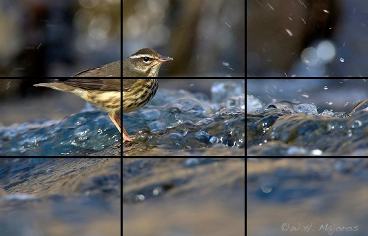
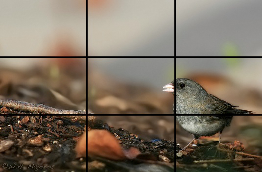
For the waterthrush below, we see
that the center of the bird’s body is well-centered around a power
point, and the water’s horizon is approaching the upper guide
line. There’s a significant color difference between the top
third of the image and the bottom two thirds. Note also that the “gully” or “pocket” of water centered around the
rightmost vertical
guide line in some ways seems to balance out the vertical protrusion on
the left that is the bird; this creates a subtle but powerful balance—or perhaps conflict—in the image.
Fig. 8.1.7 :
Yin and yang. The water gully below the horizon helps to balance
the positive projection of the bird above the horizon.
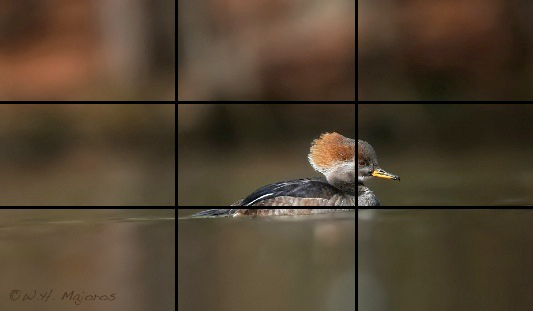
In the merganser image below, the
bird’s body aligns with the lower horizontal guide line, while the
vertical axis of the neck and head come close to aligning with the
vertical guide line. However, the water horizon doesn’t fall on a
guide line, and the bird’s eye is nowhere near a power point.
Also, the larger space is behind
the bird rather than in front of it, emphasizing where the bird has been rather than where it’s going to.
Fig. 8.1.8 :
Past versus present. Though it’s more common to leave the larger
amount of space in front of the bird, to allow for future trajectories,
here
the greater amount of space is behind the subject, emphasizing that the
bird
has been traveling for some distance, while also requiring
proportionally
more from the viewer’s imagination as to where the bird might be headed.
This is a good time to remind ourselves that the
rule of thirds (as well as the other pointers offered parenthetically
along the way) are just rules of
thumb—following them doesn’t guarantee perfection, and failing
to follow them doesn’t guarantee failure. In terms of the
much-celebrated rule of thirds,
the rule itself is actually a crude approximation to the golden ratio, which is believed by
many to underpin works by such great artists as Leonardo da Vinci and
Michelangelo. The golden ratio (also called the divine
ratio, or simply phi) places the guide lines
approximately 38% and 62% of the way across the canvas; the rule of
thirds revises these numbers to approximately 33% and 66%, which are a
bit easier to visualize when in the field since they divide the
viewfinder into simple thirds. In either case, the rules are just
“guidelines” (in a figurative and literal
sense) to help novices to get started—or for more experienced
photographers to fall back upon when the task of finding the right
composition proves especially difficult for a particular scene.
Now let’s consider some cases where the rule of
thirds has rather more limited applicability. The first notable
exception is when the entire subject doesn’t fit completely in the
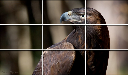
frame. The golden eagle below falls into this category.
Fig. 8.1.9 :
Macro subjects make their own rules. When the bird fills
a rather considerable portion of the frame, the rule of thirds becomes
much less dominant in the overall dynamics of the scene. Here, the
bird’s vertical axis aligns well with the guide line, but the vertical
spacing is more pragmatic, with a very modest margin above and
enough of the bird’s lower half revealed to adequately define the
wing.
Although the axis implied by the
head and neck of this bird does roughly coincide with a vertical guide
line, the head lies above the horizontal guide and the eye does not
fall on a power point. In this case, positioning the eye on the
closest power point would, in my opinion, ruin the overall balance of
foreground (bird) to background, which I think is of paramount
importance for this particular image. Of similar importance in
this image is the left-right spacing of the bird: the bird has a lot of
space on the left to gaze into, and there’s a goodly margin separating
the bird from the rightmost edge of the frame. It’s also
important that none of the vertical lines in the background are
positioned close to either edge of the frame.
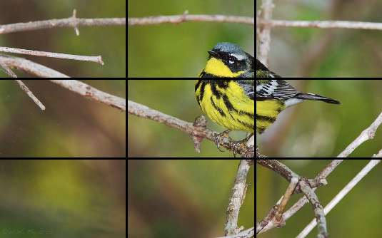
The prairie warbler below is also aligned well with
the vertical guide line, but again the eye misses the power
point. In this case, lowering the bird to allow the eye to fall
on the power point would bring the bird’s body down to the lower edge
of the frame, eliminating the branch that the bird is perched on.
For extremely close portrait shots like the golden eagle above, it’s
obviously not possible to show what the bird is perched on, but when
the bird is small enough to fit in the frame, showing its perch can
help the image to make more sense to the viewer.
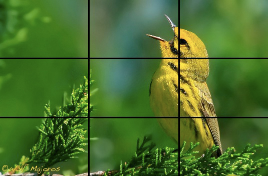
Fig. 8.1.10 :
Space for perching and singing. A singing bird needs
some space for its sound waves to travel into. For perching birds,
showing at least some portion of the bird’s perch helps to allay any
(subconscious) fears the viewer may have about the bird’s stability.
In terms of the zoom level, note
that the bird is large enough to show
significant feather detail, but is small enough to avoid touching any
of the edges of the image. Also, since this bird is singing,
positioning the bird on the right allows its song to propagate (in the
mind of the viewer) toward the left for some distances before leaving
the frame. The latter consideration falls under what some would
call the dynamics of the
image—i.e., what the viewer imagines as happening after the instant
in time frozen by the image.
In the junco
image below, the bird’s vertical axis misses the guide line, but in
this case I specifically wanted the bird to be far over toward the
right margin, to give the viewer more landscape on the left to
contemplate (to help emphasize the smallness of the bird). There
is, however, some space separating the bird from the rightmost edge of
the frame, which I consider a nearly inviolable constraint for most
bird photographs.
Fig. 8.1.11 :
Exploring the extremes in spacing. Very little of this image
supports the rule of thirds. My main concerns in choosing this
composition
were that the subject not touch any edge of the frame, that the bird
have a
(relatively) wide landscape to gaze over, and that the color and space
distribution give the impression of a small bird in a rather larger
world.
The bird’s body does coincide
nicely with the lower horizontal guide
line, but I don’t consider that to be very important in this
case. The
slope of the land and the one-third / two-thirds balance between
foreground and background are obvious contributors to the overall
aesthetics in this image.
For the
magnolia warbler below, the rule of thirds contributes very little:
though the power point falls within the bird’s body, I don’t consider
that very important in this case (except for the fact that it keeps the
bird out of the very center of the image). The important features
here are that the bird has plenty of space in front of it, but has at
least ample margins on the other sides as well.
Fig. 8.1.12 :
Symmetry and complexity. Branches and diffuse background
patterns can contribute as much as the positioning of the main subject,
in terms of the overall balance and stability of the scene.
Note
that the positioning of the main branch (that the bird is perched on)
does often come into play in composing bird photos. Perfectly
horizontal branches often don’t look very good, while branches at odd
angles can contribute a deeper symmetry to the overall image geometry.
For the snowy
egret below, though the bird’s vertical axis does line up nicely with
the vertical guide line, I think what’s more important is the amount of
space around the bird, the entry point of the bird’s legs into the
water, and the overall color distribution. Although I could have
positioned the bird higher in the frame (thereby making marginally
greater use of the upper horizontal guide line), that would have
eliminated the thin band of blue sky at the top of the frame and
allowed greater dominance of the blue of the water at the bottom,
thereby changing the overall color distribution. In this case,
however, I probably didn’t have time to consider all of those issues
when shooting, since I was just trying to keep the subject in focus and
to capture the bird with its head at a nice angle and the legs in a
non-crossing configuration.
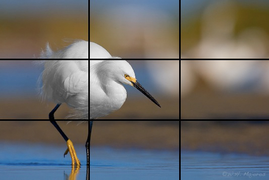
Fig. 8.1.13 :
A complex balancing act. Small changes in framing can
have significant implications for the overall impact of the scene,
including
the color distribution of the background, the overall horizontal and
vertical
balance of the salient features in the scene, and the psychological
ramifications
relating to the bird and its perceived behavioral dynamics.
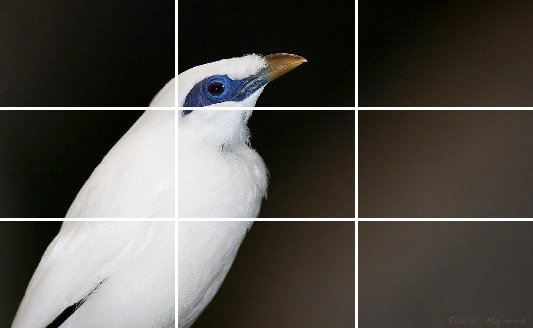
As one final
example in the context of the rule of thirds, consider the mynah shown
below. The body axis intersects with the vertical guide line, but
the significance of this is somewhat doubtful. More important in
this photo is the space distribution. The spacing on the left and
right of the bird, in this case, follows a different sort of rule of “thirds”, with the space behind the bird
taking up roughly half as much
area as the space in front of the bird. Also, the bird has some
room above its head (which is always important), and the subtle
background gradient has enough space on the left for the black to turn
light again before reaching the edge of the frame.
Fig. 8.1.14 :
Applying the rule of thirds in a slightly different manner.
This mynah divides the background roughly into thirds, but in a
non-rectilinear fashion. Giving the bird enough headroom while
showing enough of its lower body, and retaining the lightening of
the background on the left were my main constraints for this shot.
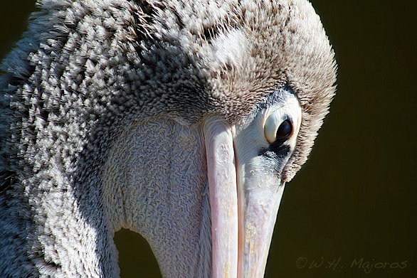
When the
subject is extremely close, sometimes all you can do is try to capture
an abstract composition involving the bird’s head. In the pelican
photo below, it may be difficult for viewers to immediately tell what
kind of bird this is, and that may enhance their curiosity. I’ve
intentionally omitted the grid lines from this photo so you can
concentrate on observing the non-rectilinear proportions in the
image—such as the proportion of feathered body surface to skin, the
proportion of lighted surface to shadowed surface, and the relative
positions and sizes of the green background regions. These
proportions aren’t necessarily “perfect” in this particular instance,
but this should at least serve as an example of what you can do with
the distribution of textures and colors in an image via creative
framing (where “framing” in this case refers to
composition and bird
placement, not to the addition of an outer wooden frame).
Fig. 8.1.15 :
A study in proportions: feather to skin, sunlit to
shadowed, and foreground to background. These aren’t all
necessarily “perfectly” proportioned
here, but they give the
viewer something to contemplate—in addition to wondering
what kind of bird they’re looking at.
While all of
these considerations involving “divine proportions” and “golden ratios” may indeed have some merit in
both the analysis and construction of artistic images, in the field
there’s typically not enough time to think through these things
systematically. In the field I’m usually happy just to get an
in-focus, properly exposed image, which I might later be able to crop
(in Photoshop) into a pleasing composition. Even in those rare
occasions when the bird is so extremely cooperative that I can think
about composition, I never do so (explicitly) in terms of grid lines or
mathematical relations. Instead, I just search through the
possibilities for framing the subject and scenery until I see something
that strikes me as especially pleasing. In many cases I
intentionally blank my mind, letting the primitive instincts of my
visual cortex have free reign.
Finally, let’s consider the size of the bird in the
frame. If you have a zoom lens (or can change lenses or add
teleconverters) or can easily move closer to the bird or further away,
then you’ll typically be faced with having to decide how much “zooming”
(whether via the lens’ zoom or via your biological “foot zoom”) to apply before
taking the shot. In most cases, this is just another aesthetic
consideration. However, if you intend to make prints of your
images, it’s sometimes good to add a little extra space around the
outside of the frame, to account for any cropping that will be applied
by the printing process. This is primarily a concern when making
canvas wraps (see sections 14.1 and 14.2), in which case parts of the
image will
be wrapped around the sides of the underlying wooden frame. When
making canvas wraps, printers often stretch the canvas a bit further
than necessary, to ensure that no white canvas is showing around the
edges; this can sometimes result in the bird being closer to an edge
than you’d like, possibly even wrapping around onto the side
panel. Adding a wide margin when taking the shot can help to
avoid this problem. For traditional, framed and matted prints,
this is less of an issue, because the mat typically only covers a thin
margin around the outside of the image.
All of the foregoing composition techniques can be
used either in the field (with an especially cooperative bird) or later
during postprocessing, when trying to decide how to crop the image
around the subject. For fast-moving birds such as warblers, I
virtually never think of composition in the field; when dealing with
such small birds, there’s typically plenty of room around the bird in
the frame, affording much flexibility for creative cropping later in
postprocess. In these cases I’ll generally use the center focus
point and just keep the subject in the center of the frame.
During postprocessing I can decide whether to leave the bird in the
center or to crop off-center. Even with an 8 or 10 megapixel
camera you’ll often be able to crop the image fairly aggressively, at
least for images intended for viewing on a computer (e.g., via web
pages on the internet).
Although the position of the bird in the frame is
obviously of prime importance in bird photography, there are other
important aspects of image composition that need to be
considered. We’ll address several of these in the next two
sections of this
chapter. For now, just keep in mind that scene composition is an
artistic consideration, and as such is entirely up to you as the
artist. As an artist, it’s your right to choose whatever
composition feels best to you, and you shouldn’t feel pressured to
compose your images according to how someone else thinks you should
compose
them. Adhering too closely to the prescriptions of other
photographers is likely to lead to
images that are stylistically identical to the thousands of images
already published by the current crop of so-called “experts” and “professionals”. That’s fine, if that’s
what you want to do. In fact, imitating the “old masters” can be a great way to start out,
but in time you’ll likely feel the urge to exercise your own
creativity, and you shouldn’t feel pressured to supress that creativity
in order to satisfy someone else’s rules about how bird photos should
look. Think of your photographic activities as an opportunity to
explore your own artistic vision and instincts, rather than
as a prescriptive activity dictated by a handful of “experts”. Remember that there are no
rules in art. Following any set of rules can lead, in the long
term,
to stagnation. Above all, remember that art—even
photographic art—is something that you can do in pursuit of your own
personal happiness—whatever that means for you as an individual.
|