|
11.6 Sharpening
Probably the most
under-appreciated challenge of digital postprocessing of bird images is
that of sharpening.
Recall that because most DSLR cameras employ an anti-aliasing filter in front of
the imaging sensor, which has a dispersive effect on the pixel
information in the raw image, some degree of artificial sharpening in
postprocess is almost always necessary in order to reclaim the
crispness of the original scene.
When I first started digitally processing bird
images, I never expected the degree of difficulty I would eventually
face in trying to find the ideal sharpening parameters for my
images. One of the problems is that my tastes regarding the ideal
amount of sharpening have changed over time. At first I liked
seeing all of my images with maximal sharpness—probably because I had
become so frustrated with the softness imparted by the optically
inferior lens I was using at the time. In time I became aware
that many of my postprocessed images appeared over-sharpened—a quality that those
with experience in digital imaging can identify almost immediately,
though to novices it’s not always immediately apparent.
Over-sharpened images, more than anything else, carry the stigma of
being the product of an amateur—or,
worse yet, someone lacking any semblance of artistic talent or taste.
As a result, I stopped sharpening my images so
aggressively, and in some cases I over-compensated by leaving my images
too soft. I’ve now realized that there is a very, very delicate
balance between artificial sharpening and natural softness that
produces the most aesthetic images—at least from my perspective.
Sharpness, like any other image aspect, is to a large degree a
subjective quality. For that reason, there are no hard-and-fast
rules that can be followed to always consistently produce the ideal
results. As with any art form, you need to learn to listen to the
intuition embedded in your visual cortex and other primitive brain
centers to aid your rational decision-making during
postprocessing. In this section we’ll consider a number of issues
and general rules-of-thumb that you can use as an initial set of mental
crutches as you refine your sharpening technique.
First, let’s consider the tools at your
disposal. In Photoshop, there are several distinct tools that can
be used to artificially increase the sharpness of an image. The
one I recommend most strongly is the Sharpening
pane in Adobe Camera
Raw (ACR), which is depicted in the figure below.
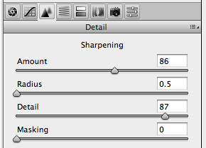
Fig. 11.6.1:
The Sharpening pane of Adobe Camera Raw.
The advantage of sharpening in
Adobe Camera Raw (ACR) is that the sharpening algorithm used by the
software has access to the largest amount of information, since it is
applied directly to the RAW file during conversion to Photoshop’s
internal representation. Keep in mind, however, that the degree
of advantage that you gain from performing sharpening during RAW
conversion (versus doing it later, after conversion, in Photoshop
proper) may very well be camera-dependent, since the process of RAW
conversion is necessarily tailored to the different file formats of
different camera vendors. For my Canon EOS 1D Mark III camera, I
find
that the sharpening effect that I can achieve in ACR is far superior to
what I can achieve later in Photoshop proper (with default ACR
settings), so I try to perform the
bulk of my sharpening in ACR, though I always apply a bit of additional
sharpening later in Photoshop proper, after conversion and resizing of
the image for the specific distribution medium (e.g., web page,
photographic paper, or canvas).
In the above figure you can see that the version of
ACR that I currently use provides four sliders: Amount, Radius, Detail, and Masking. I
always leave Radius at 0.5
and Masking at 0, and then
try to find the
ideal settings for Amount and
Detail. Note
that in some versions
of ACR, the effect of these sharpening sliders is only apparent when
viewing the image at 100% zoom. In my experience, the Detail
slider tends to affect the finest details in the image, and should be
set most aggressively, while the Sharpening
slider needs to be set more
conservatively to avoid artifacts due to over-sharpening.
After setting the sharpening parameters (and any
others in ACR), I then convert the image from RAW and view it in
Photoshop proper. Often I’ll find that the image, after
conversion from
RAW, doesn’t exhibit the ideal amount of sharpening, and I then need to
close the file and re-open it in ACR so that I can change the
sharpening parameters and re-convert from RAW. Though this is an
awkward and inconvenient process, I generally find that it’s more than
worthwhile, since the sharpening tools in Photoshop proper often can’t
reproduce the exact sharpening effect that those in ACR can.
Once I’ve got the image into Photoshop proper and
I’m
more-or-less satisfied with the sharpness of the full-resolution image,
I then reduce the resolution as desired (via the Image
Size window, which I have tied to the Cmd-I key combination on
my computer) and adjust the sharpness of the reduced image using the Unsharp Mask tool of Photoshop,
which is depicated below.
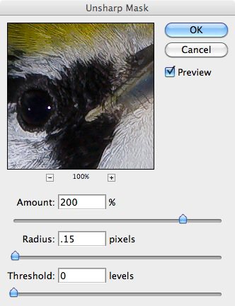
Fig. 11.6.2:
The unshsarp mask in Photoshop.
The Unsharp Mask is by far the
most popular sharpening method in Photoshop. As you can see
above, the tool provides a tiny preview of the image, though with the Preview check-box
checked, the entire image will also act as a preview
(though you should make sure that the image is zoomed to 100% before
using the image preview to assess the effect of sharpening).
The three parameters of the Unsharp Mask are Amount, Radius, and Threshold. For the vast
majority of cases, I set the Threshold
to 0 and
the Radius to 0.15, and then
adjust the Amount slider
until the image looks best to my eye. For my current version of
Photoshop (version CS3), 0.15 is the smallest radius that has any
effect, so it allows me to attend to the smallest possible details in
the image. In some cases I do find that 0.15 results in too many
image artifacts (primarily whitish pixels appearing in the busiest
parts of the bird’s plumage), and will then set it instead to
2.0. On rare occasions I’ll use a radius of 1.0 in conjunction
with an extremely small Amount
setting; this tends to improve the
overall perception of clarity in the bird without over-sharpening the
fine details or introducing halos and other artifacts associated with
over-sharpening. It’s worth experimenting with the Threshold
slider in cases in which you keep getting artifacts whenever you get
close to the amount of sharpening that you think is required. The
Threshold
parameter can sometimes eliminate or reduce those artifacts
without affecting the resulting clarity achieved by the
sharpening. But for the vast majority of post-conversion
sharpening that I do, the Threshold
is set to 0 and the Radius to
0.15,
and I just painstakingly vary the Amount
slider until the image (at
100% zoom) looks good to my eye.
Though the Unsharp Mask is the most popular sharpening
method for serious Photoshop users, there is one other tool that some
people
swear by: Smart Sharpen.
This tool is considerably more
sophisticated than the Unsharp Mask.
First, it allows you to set
separate sharpening parameters for shadow
and highlight regions of the
image. Second, it automatically applies a post-sharpening blur to
help reduce artifacts introduced by the sharpening procedure.
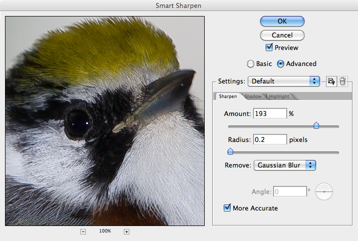
Fig. 11.6.3:
The Smart Sharpen tool in Photoshop.
The Smart Sharpen tool is highly
flexible and undoubtedly very powerful. I’ve personally avoided
using it
because I find that the preview that is rendered in real-time doesn’t
always match the way the image looks after I press the OK button and
commit the changes. I instead find the combination of sharpening
in ACR and fine-tuning later in Photoshop via the Unsharp Mask (after
changing image resolution via the Image
Size tool) to provide all the
flexibility I need. The real challenge is finding the ideal
parameter settings for these respective tools, so as to produce the
most
aesthetically pleasing bird images. The latter goal is what we’ll
concentrate
on for the remainder of this section.
First, we need to note several things. The
issue of monitor-dependence is one of the most important—and most
unfortunate. After upgrading my Apple
laptop to a newer model of
the same line, I noticed that many of my bird photos that looked
tack-sharp on my older laptop no longer looked so nice on the newer
machine. Different computer monitors can differ fairly
substantially not only in the pixel
pitch (the number of pixels per millimeter—or, stated
differently, the size of the individual pixels, in micrometers), but
also in their color fidelity and contrast
ratio. As computer
manufacturers continue to make improvements to their hardware over the
years, newer monitors will inevitably become better and better.
Unfortunately, this doesn’t necessarily mean that your images,
postprocessed on an older monitor, will look better on newer
monitors. Over time you’ll become highly proficient at precisely
optimizing your images so as to look virtually perfect on your
particular computer’s monitor. Just keep in mind that differences
in
rendering technologies will result in your image looking somewhat different (whether
better or worse) on other peoples’ monitors. This is a very
frustrating
aspect of digital imaging, but one that does not seem to have any
practical solution at present. (See section 16.2.4 for a
discussion of the
related issue of gamma
differences between monitors). Note also
that sharpening is highly medium dependent, so don’t assume that the
ideal sharpening for internet distribution of your images will also
serve as the optimal parameterization for printing (see Chapter 14).
Second, it’s important to note at the outset that
the ideal sharpening amount can be highly variable across the
image. In particular, you’ll typically want to sharpen the eye
and beak separately from the rest of the bird, since the eye and beak
are the two most psychologically salient features to human observers of
birds. I generally sharpen the beak more than any other part of
the bird, often setting the Amount
slider to 500% in the Unsharp
Mask. The eye I typically sharpen less than the beak, but
more than any other part of the bird. In both cases (eye and
beak) I generally use a radius of 0.15. Sharpening of the eye and
beak is usually very straightforward. The difficulty generally
arises when trying to find the ideal amount of sharpening of the bird’s
plumage. This will, therefore, be the focus of the rest of this
section. We'll proceed largely by anecdotal illustration, since
this is a highly subjective issue and will necessarily vary in subtle
ways from image to image.
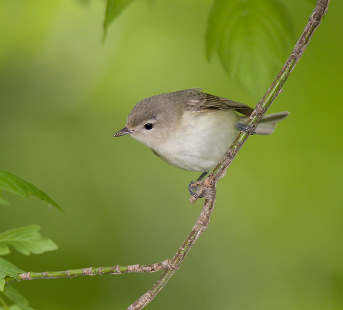
Let’s start by
considering the example illustrated below. For this flycatcher,
the eye and beak appear suitably sharp (the beak could be slightly
sharper, but it’s at least acceptably sharp). What remains is to
assess the sharpness of the bird’s plumage.
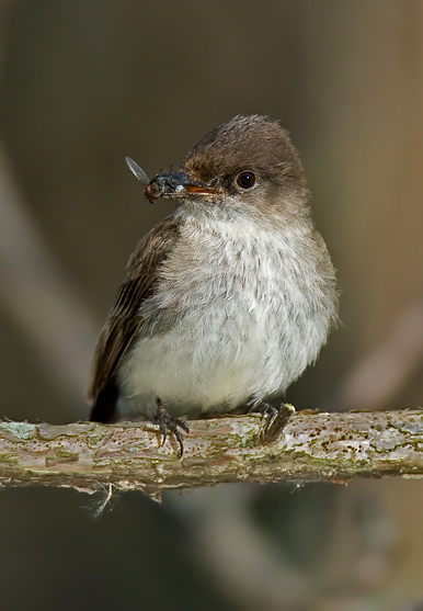
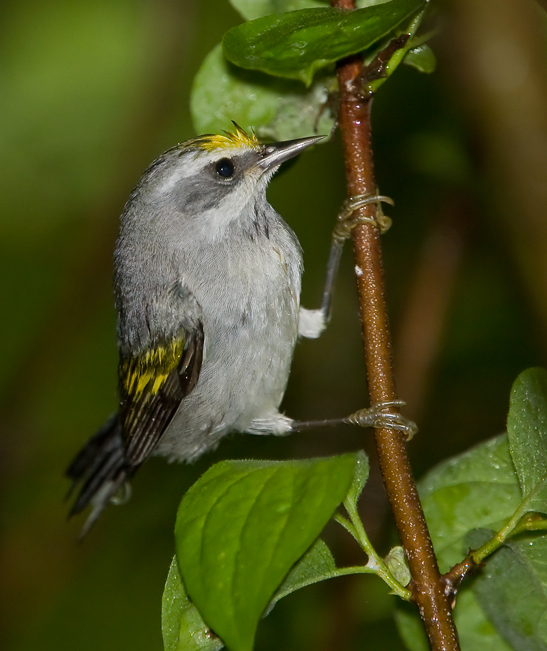
Fig. 11.6.4: Flycatcher with a fly.
For this particular example, the overall bird appears suitably
sharpened on my
monitor—though on yours it may appear over-
or under-sharpened,
depending on your monitor’s pixel characteristics. On my monitor
I can just start to discern the individual feather barbs making up the
bird’s plumage, though none of those fine-scaled biological features
show any obvious image artifacts here (on my screen, at least).
The white parts of the
bird’s ventral side show sufficient detail in all areas, indicating
that little or no over-exposure has occurred. The top of the
bird’s head
exhibits some feather glare, possibly due to flash, and there are
a few sharpening artifacts—apparent as whitish pixels that stand out
from the
rest. Take special note also of the wing feathers. They
vary
from sharp to soft, largely as dictated by the depth-of-field (DOF)
induced by
the configuration of the optical system (e.g., the aperture and
distance to subject), and are therefore somewhat natural. The fly
in the
bird’s mouth could, in my opinion, be sharper, as could the bird’s feet.
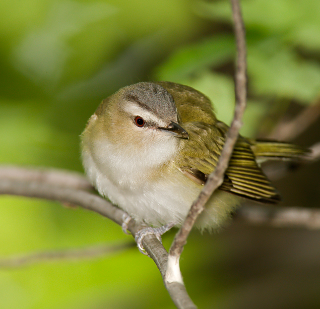
Continuing in the vein of instruction-by-example,
let’s consider the bay-breasted warbler shown below. The beak
appears suitably sharp, as does the eye. The rest of the head is
less sharp. The bird’s upper back appears quite sharp, and in my
opinion shows very few (if any) sharpening artifacts. The flight
feathers on the left wing show a region of very nice sharpness, though
the DOF is very shallow here, so the tips of those feathers are
suitably blurred. The bird’s right flank looks a bit unnatural to
me, though the number of sharpening artifacts (i.e., unnaturally
whitish pixels) in this region isn’t terribly large. The bright
part of the bird’s dorsal neck (the thin slice of direct sunlight
striking the bird from behind) does appear over-sharpened, showing that
over-sharpening can be exposure-dependent.
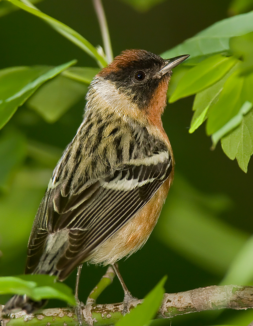
Fig. 11.6.5:
Bay-breasted warbler.
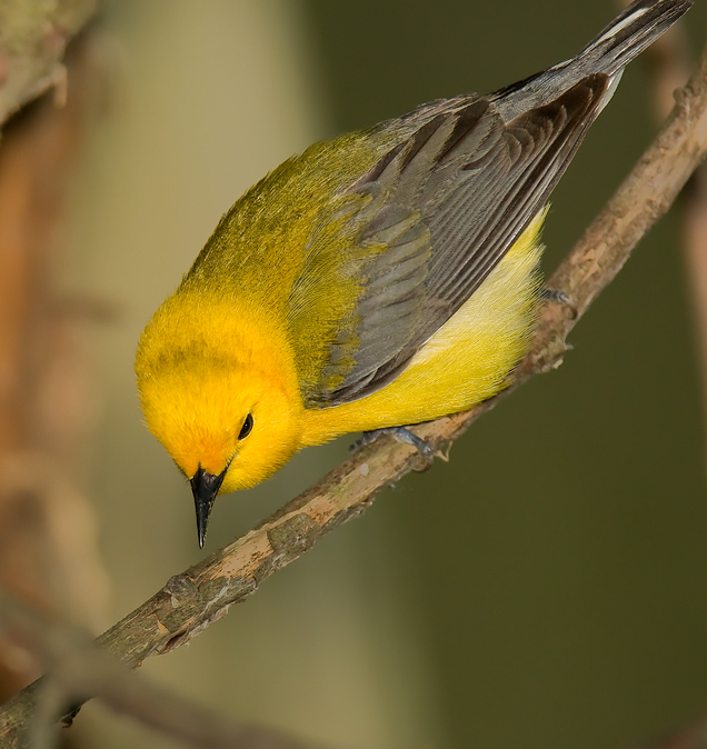
For the next
example, a Prothonotary warbler, the sharpest elements are the beak and
the toes. The DOF is again shallow, with the in-focus area
including only the bird’s head and feet, and the perching
substrate. Keep in mind that DOF is a natural phenomenon that
viewers can intuitively relate to, so don’t try to unnaturally sharpen
parts of the bird falling outside the shallow focus area. In the
example below I think the beak is adequately sharpened, and the eye is
probably adequately sharpened as well, though the rest of the bird’s
head (particularly the throat region) could be sharpened slightly
more. In this case the wing coverts could probably have been
sharpened a tiny bit more, since they’re obviously a high-contrast
feature on this bird. Note that sharpening of the intense yellow
regions of this bird can be difficult, since sharpening filters will
tend to produce artifacts (isolated bright pixels) in these types of
cases. Don’t hesitate to select even the smallest regions of the
bird for differential sharpening. Also, recall (from section
11.2) that the Highlights
filter can in many cases be used to bring out subtle details in bright
plumage areas; the Unsharp Mask
isn't the only tool at your disposal in this regard.
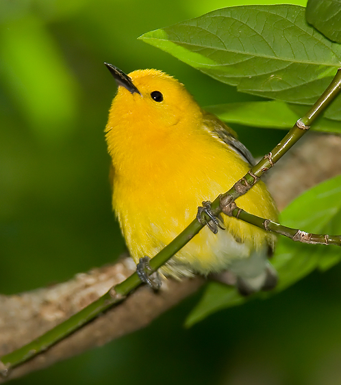
Fig. 11.6.6:
Prothonotary warbler.
The image blow is of another Prothonotary
warbler. In this case, a bit a over-sharpening is apparent,
primarily in the back, mid-wing, and flank regions of the bird.
To me, the head and beak look nearly perfect, with no evidence of
over-sharpening. The tail looks likewise quite acceptable
as-is. Notice in this example that the wing comprises a number of
different regions, each with different sharpening needs, due to their
differing positions relative to the focus plane. The nearer parts
of the wing look perfect to me, the middle portions somewhat blurry,
and the distal portions again suitably sharpened.
Fig. 11.6.7:
Prothonotary warbler.
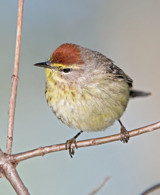
For the Palm
Warbler image below, we’re again faced with an exceptionally shallow
DOF, comprising less than an inch of perfectly in-focus area. The
beak falls somewhat outside this area, and is consequently
less-than-perfectly sharp. The sharpest regions are the throat,
the cheek, the dorsal portion of the head and nape, and the upper
chest. The only parts that strike me as slightly over-sharpened
are the throat (directly beneath the beak) and the nape, which exhibits
some very, very slight artifacts (isolated whitish pixels). The
top of the head could use some more sharpening, in my opinion, possibly
with a large radius and small amount.
Otherwise, the lack of sharpness in the regions of the bird outside the
focus area seem appropriate to me, given the shallow DOF.
Fig. 11.6.8:
Palm warbler.
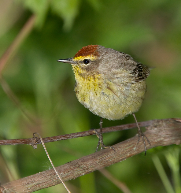
The next
example again features a palm warbler. In this case the eye and
beak look slightly soft to me, as does the rusty cap, while the bird’s
chest, back, belly, and wing look well-sharpened on my monitor.
To
sharpen up the eye and beak in this example, I’d simply use the Quick
Select tool to select those regions and then open the Unsharp Mask
while those regions are still selected. When there is an active
selection in the image, the Unsharp
Mask affects only those selected
regions (just as with any other filter in Photoshop).
Fig. 11.6.9:
Palm warbler.
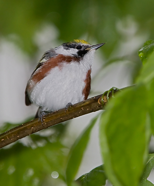
For the next example (below) we have a
chestnut-sided warbler. On my
screen the overall sharpness looks fine, though the beak could use a
bit more sharpening. Notice that the white underside of the bird
has a large amount of detail. Much of what you’re seeing in that
white region is actually an artifact of agressive sharpening, in
combination with micro-contrast
induced by flash (see section 7.1). The
local aggregations of
pure white
pixels would, in a non-white part of the bird, create an impression of
over-sharpening, but in the pure white plumage it can sometimes help to
over-sharpen in order to emphasize details that would otherwise go
unnoticed in a sea of almost pure white.
Fig. 11.6.10:
Chestnut-sided warbler
Our next example features a golden-winged warbler
(below). The
only thing that appears under-sharpened on my monitor is this bird’s
eye. The near-white underside of the bird is, in my opinion,
tastefully over-sharpened—meaning that over-sharpening of this
near-white area has brought out details that would be otherwise
difficult to see. In contrast, the bird’s back is just starting
to show some moire artifacts
due to sharpening, and these generally
aren’t aesthetically pleasing. In this case, on my monitor, the
effect is quite tolerable, but if it were sharpened just a tad more it
would probably look offensive to my eyes.
Fig. 11.6.11:
Golden-winged warbler.
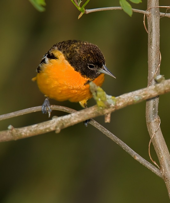
For the Baltimore oriole below,
the overall sharpeness looks good on my monitor. The beak and
head feathers are well-defined, though the beak could possibly use just
a tad
more sharpening. Beaks can take quite a lot of sharpening without
looking over-done, certainly more so than feathers. Keep in mind
that all of these images will likely be rendered at a different pixel
pitch on your monitor (unless you happen to have exactly the same
laptop model I’m using), and your assessment of what looks like an
ideal amount of sharpening will likely differ. This is the curse
of media-dependent image qualities (of which sharpness is just one).
Fig. 11.6.12:
Baltimore Oriole.
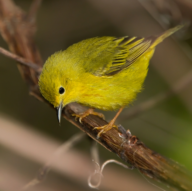
Continuing on to the next example image, the female
yellow warbler
below looks slightly soft to me in her eye, while some moire patterning
in the bird’s back feathers suggests over-sharpening. Moire is,
of course, a natural phenomenon that you can perceive even when viewing
the bird with your naked eyes, and is especially prevalent in certain
types of feather patterns. The difficulty is to try to both avoid
creating unnatural moire patterns and to also avoid exacerbating
natural
moire patterns into what many viewers will perceive as sharpening
artifacts (whether they are or not). This simply requires
experimentation with different sharpening levels as applied to the
specific part of the bird that is most moire-prone.
Fig. 11.6.13:
Female yellow warbler.
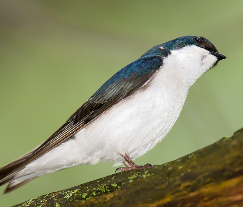
The next example (below) again
illustrates the value of aggressive sharpening in white plumage.
Though this bird’s underside is arguably not over-sharpened, a bit of
over-sharpening might actually help to further emphasize the detail
present in that vast white region. Regarding the rest of the
bird, I find the lower wing feathers to be appropriately sharp, the
upper wing feathers to be appropriately soft, and the face (including
the eye) to also be appropriately soft. The eye, which appears
remarkably three-dimensional in this image, could probably bear
additional sharpening, but in this case I think it has enough
definition to stand as-is. Though the beak could be sharper, its
slight softness matches that of the rest of the face. Remember
that modern viewers are aware (even if subconsiously) of the issue of
depth-of-field (DOF), so when your DOF is razor-thin, some softness in
the out-of-DOF regions are not only acceptable but indeed
expected. To the extent that you may be striving for a true “photographic” look (rather than an artificial, “painted” effect), your sharpening strategy
should respect any apparent DOF in the image. For more abstract
works, however, such constraints can be largely set aside.
Fig. 11.6.14:
Tree swallow.
The vireo image below illustrates
the value of softness (as opposed to sharpness) for certain
images. To my mind, vireos appear naturally soft, and for that
reason I’ve left much of the bird under-sharpened (especially parts of
the bird below the head). A slight suggestion of moire is still
present, however, in the visible portion of the bird’s back and in its
cap. The beak and eye appear appropriately soft for this
image. Over-sharpening of the white underside has not been
applied, in agreement with the overall soft theme of this image.
The bird’s feet and the branch it’s perched on could use more
sharpening, however.
Fig. 11.6.15:
Vireo.
In contrast to the image above,
the red-eyed vireo in the image below exhibits some obvious sharpening
artifacts (as well as a bit of over-flash in the face and neck).
Moire is clearly present in the cap. The eye is quite sharp,
though the beak unfortunately falls somewhat out of the DOF and
therefore appears soft. Some moire is apparent in the bird’s back
and in the wing coverts. A bit of over-sharpening is also
apparent in the part of the bird’s head starting at the right cheek and
extending around toward the back of the head. Though the perfect
sharpness of the eye may appear a bit unnatural if you look too closely
at it, the extreme sharpness helps to focus the viewer’s attention on
the most salient aspect of the creature, and to establish the center of
the DOF.
Fig. 11.6.16:
Red-eyed Vireo.
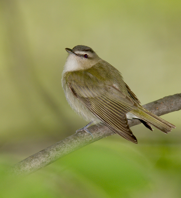
For the next vireo (below), we’ve
again opted for an overall soft look, though a number of sharpening
artifacts are nonetheless present. The white pixels in the bird’s
belly are just slightly over-sharpened: they create the impression of
excessive flash in that part of the bird. The flight feathers
appear appropriately soft on my monitor, and the primary and secondary
coverts seem slightly soft, but consistent with the overall theme of
the image. Moire is clearly present, however, in the bird’s back,
and some over-sharpening is apparent in the bird’s cap. The beak
is appropriately soft for the image. The tail looks a bit too
soft to me.
Fig. 11.6.17:
Red-eyed Vireo.
As one final example, the
chestnust-sided warbler below combines tasteful softness in the wings
with moderate over-sharpening in the white ventral regions to create an
image featuring a range of textures. I’d personally prefer to see
the white ventral region slightly less over-sharpened.
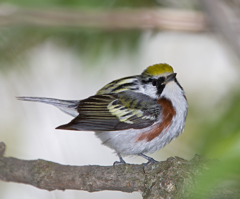
Fig. 11.6.18:
Chestnut-sided warbler.
One trick that
may help you in finding the right sharpening parameters is to first
duplicate the bird layer, apply fairly aggressive sharpening to that
duplicate layer, and then decrease the layer opacity in the Layers panel. Sometimes
exploring different opacities of the sharpened version of the layer
makes it easier to make up your mind about how much sharpening you
want. In some cases you may also be able to achieve an effect
that direct sharpening can’t give you, since sharpening artifacts can
be softened by the blending of the sharpened layer with the unsharpened
layer. I find that this approach often seems to make the effect
of the sharpening more subtle, so that the bird looks sharp without looking artificially sharpened. A related
technique is to subject the duplicated layer to a high pass filter (Filter > Other > High Pass)
with a radius of 0.5, and then to set the layer's blend mode to Overlay or Soft/Hard/Vivid Light, with an
appropriate opacity.
Occasionally
you’ll find that no matter what sharpening parameters you try, the
final product never looks right to you, even when the original photo
lacked any obvious motion blur or focus problems. One thing you
can try is to apply the sharpening and then to reduce contrast slightly
via the Brightness/Contrast
tool. Though sharpening works by increasing local contrast, it sometimes
results in an apparent increase of contrast at a courser scale, which
the Brightness/Contrast tool
can rectify by dialing in -5 or -10 for the Contrast slider. In rare
cases you might also find that adjusting saturation a tiny bit can
alter your perception of the effect of a previously-applied sharpening
pass. Remember also that noise reduction and sharpening (in
either order) can interact to create an effect that looks better or
worse, depending on the image and the chosen sharpening or denoising
parameters.
|
|
|