|
Chapter
14
Making
and Selling Prints
Although many (perhaps most) digital images are never actually printed
out as actual, physical photos, being instead viewed on a computer,
over the internet, or via a so-called “digital picture frame” or other device (e.g., cell
phone, ipod, etc.), many digital artists still see the physical
(non-electronic) rendering of their images as a requisite part of the
natural lifecycle of their digital works. In this chapter we’ll
survey some of the options available for producing high-quality prints
of digital bird photos, including both the print-at-home and
frame-it-yourself options, as well as the more expensive (though often
higher quality) option of professional development through a photo
lab. We’ll also take a brief look at some options for selling
prints directly to the public, as well as getting your prints into art
shows and galleries.
14.1
Practical
Printing Issues
Making prints is obviously a
simple matter if you’ve got an inkjet printer at home and you’re only
making prints for your own personal enjoyment. It can get more
complicated, however, if you want to make a quality work of art that is
to be put on display, whether in the home or in a local gallery.
Things get even more complicated if you want to sell your prints to
other people, who may be picky not only about the quality of the
complete package (i.e., the photo and its attendant frame or other
mounting device), but also the expected longevity of the print
itself—i.e., how well its colors stand up to the fading effects of
exposure to light and/or time. Although some additional research
will undoubtedly be required on your part as you consider particular
products for use in your photographic process (i.e., brands of
paper/ink/lamination), in this section we’ll at least cover the broad
issues that you need to be aware of, and which can guide you in seeking
higher print quality. As digital printing processes continue to
advance, this section can be expected to evolve in future
revisions.
14.1.1
Printing at Home
The most laborious (but sometimes most economical) option for making
prints is to buy a quality inkjet printer and make your prints at
home. The biggest problem with this approach is that you end up
being limited by the capabilities of the particular model of printer
that you end up buying (compared to the typically much greater
capabilities of the commercial print labs). And unless you happen
to be a professional printer repairman, it’s not unlikely that at some
point you’ll have to deal with the frustration of having a broken
printer that needs to be sent in to the factory for repairs—possibly at
the exact moment when you’re trying to print out your greatest
masterpiece.
Nevertheless,
having a printer at home can be highly useful, even if you end up
having your most important printing tasks fulfilled by a professional
lab. Once you’ve got some experience with printing both at home
and via an external lab, you’ll begin to understand the systematic
differences between what you see on your computer screen, what you see
when you print the image on your personal printer, and what you see in
the final result from the lab. Once you’ve mastered this
three-way relationship, you’ll be well-equipped to produce image files
that will consistently result in pleasing lab results.
As a concrete example, I’ve found that my external
monitor (not the one on my laptop) displays images with significantly
more color saturation than what ends up coming out of my printer.
Fortunately, what comes out of my printer matches almost precisely what
comes out of the professional lab that I use for larger-sized prints
and canvases. Furthermore, by applying a fixed gamma adjustment (see section 16.2.4) to an image before
sending it to my home printer, I’ve managed
to reduce the differences between the image on the monitor and the
image that comes out of the printer.
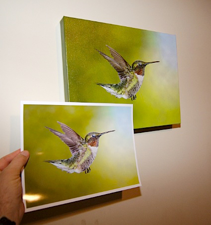 Fig.
14.1.1 : Comparing print color. Lower left: a print made on my
home printer.
Upper right: a gallery wrap (canvas) made by a pro lab. Although there
are often
very slight differences in color between prints that I make at home and
those that I get
from the pro lab, the match is close enough that I can be confident
when ordering
expensive print products, such as gallery-wrap canvases. Getting
the prints to look
like the images I see on my computer screen is much harder, even after
calibration.
Fig. 14.1.2 :
Assessing color and sharpness via small trial prints. Before
ordering a costly
print product from the pro lab, I first make a series of prints at home
to ensure that I’ve got
the color right (upper left) and also that the bird will appear sharp
at the target print size
(lower left). These can both be done with 4×6 prints.
High-quality 4×6 paper is
cheap,
and doesn’t use up much ink. By scaling my image to the target
size before printing,
I can spot-check sharpness at any target print size, even those too
large for my printer.
Because my production workflow—the process I
described above—is specific to my particular hardware, you’ll need to
develop your own workflow specific to your particular hardware if you
want to produce professional-quality prints that optimally match what
you see on your computer’s monitor. In an ideal world, this task
would be rendered trivial via the process of color calibration, which can now be
fully automated via a (roughly) $100 calibration tool.
Unfortunately, as we’ll see in section 14.1.2
below, color calibration
doesn’t always work.
A few additional issues related to printing at home
are worth delving into. First is the issue of cost. The
cost of an individual print is obviously impacted by the per-page cost
of paper as well as the cost of the ink used by the printer and the
rate at which the printer uses that ink. In practice, this is
something that you can’t really assess until you’ve already purchased
the printer and made a number of prints with it, since ink usage can
obviously depend on the properties of the images that you tend to
print—i.e., how much saturation you tend to use, and whether you tend
to print images that are very bright or very dark. Any
cost/benefit analysis should of course reflect differences in print
quality between what you can get out your home printer and what your
chosen lab is capable of producing. In some cases this may be a
small difference, and in others it may be quite large, depending not
only on the quality of the respective hardware involved, but also on
how exacting you are in your comparisons. If your interest is in
selling artwork to the public, you also need to consider how exacting
your potential customers are in their assessment of print quality.
Another important consideration is the amount of
effort that you can expect to have to exert in maintaining your
printer. Certain brands of printers (such as Epson and
Hewlett-Packard) have a reputation for experiencing frequent failures
due to clogged nozzles.
On some printers, a clogged ink nozzle may require replacement of the
entire print head, which may
cost you $80 (US) or more. My old HP printer developed a clogged
print head twice, the second time coming only two weeks after I had
replaced the previous head. That printer has now joined its
ancestors in printer heaven.
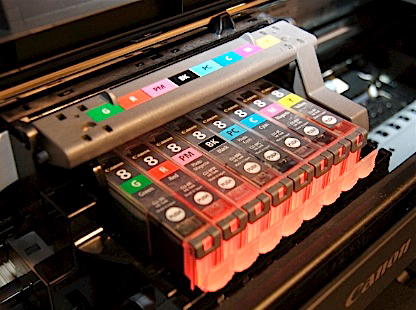
Fig. 14.1.3 :
Array of ink cartridges in a personal printer. This printer
(Canon Pixma Pro9000 II) takes eight cartridges. The full set
costs around
$120 US (it’s cheaper on Amazon). Fortunately, this printer is
very efficient
in its use of ink, so I only end up spending about $15 every week or so
for
a new cartridge.
Another common problem that owners of printers
frequently have to deal with is incorrect feeding of the paper,
resulting in paper jams.
The part of the printer which grasps the next sheet of paper in the
paper tray can become dirty or excessively worn, resulting in slippage
when the paper is drawn into the feed path. Rollers inside the
printer can likewise experience slippage, resulting in sheets of paper
being drawn in crookedly, causing the paper to wad up and jam the
printer. When these incidents are isolated, they are
tolerable. But when they occur repeatedly, even freqently, they
can be extremely frustrating.
As with any computer peripheral, issues of hardware
and software compatibility can sometimes arise. In the case of
printers this can manifest itself in subtle ways. When printing
to my Canon printer from my Apple laptop, I find that the prints appear
consistently darker than the image I see on my screen, and I believe
this is due to Canon’s engineers not correctly accounting for
differences between the gamma
settings of Mac and Windows monitors. By performing an explicit
gamma adjustment prior to printing my images, I’ve been able to largely
eliminate this problem. A number of tools allow you to adjust the
gamma setting of an image, including Photoshop and most of its
commercial competitors. On my Macintosh I use a free UNIX tool
called ImageMagick to adjust
the gamma setting on bulk sets of photos; the built-in “Preview” tool in OS X can also be used to
adjust gamma, via an on-screen slider. Gamma is discussed further
in section 16.2.4.
14.1.2
Color Calibration
As alluded to above, color calibration is a necessary step in setting
up a new computer system, though it’s not guaranteed to succeed in
making color management a fully transparent process in image creation
and publishing. The goal of calibration is, ideally, to alter the
way your monitor displays images, so as to make those images appear on
your monitor exactly the way they would appear when rendered onto paper
by your printer (or by your favorite commercial photo lab).
Proper calibration is best done with an external
optical device, which generally has to be purchased (unless you can
borrow one from a friend), and these typically cost over $100
(US). One popular manufacturer of calibration devices is X-Rite, who offer a product called Eye One (other companies such as Pantone and Datacolor offer similar
products). I used this product to calibrate my external monitor
twice. Each time, what I found was that images displayed on the
monitor were consistently far more saturated than the images produced
by my printer (or by the pro photo lab I sent them to), even after
calibration.
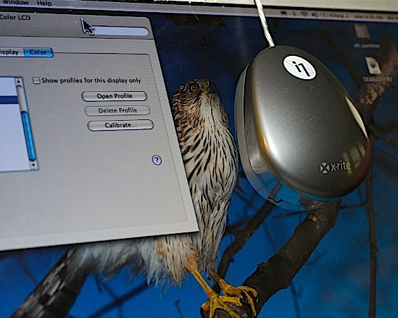
Fig. 14.1.4 :
An optical sensor for calibrating a monitor. The device hangs
from the top
of your monitor and reads color information from the screen. A
special software program
(not shown here) runs during the calibration that changes screen
intensities and hues and
observes the effect read in by the optical sensor. This
particular device cost me about
$100 (US), but I’ve seen others as cheap as $60 and as expensive as
$300.
In practice, even when calibration is successful
your monitor may end up being perfectly calibrated to one printer but
not to another. The same image file when printed both on my home
printer and also printed by the pro lab never look 100% identical, so
even if I could achieve perfect calibration between my monitor and my
home printer, that same calibration
profile wouldn’t result in a perfect match between my monitor
and the printer used by the pro lab. In practice what you’d need
to do in these situations is to maintain separate profiles to use when
targeting different printers, or more generally different media (see
below).
A related issue to that of color calibration is that
of color spaces.
Broadly speaking, the two most common color encodings are RGB (for Red / Green / Blue) and CMYK (for Cyan / Magenta / Yellow /
blacK). Several varieties of RGB are in common use, with the most
popular being sRGB.
Different color spaces use different binary encodings for component
colors. Thus, if an image encoded in sRGB were to be printed
directly on a CMYK printer—without an explicit conversion of the image
file to CMYK first—the printer would in most cases mis-interpret the
pixels as having different colors than those you see on the
screen. The issue of color space is typically more important when
sending photos to a professional lab, since you need to know beforehand
which color space(s) are supported by the lab. For home printers,
it’s best to keep your photos in their original color space, which for
most DSLRs will be sRGB by default.
For web distribution of images you should ensure
that your photos have an sRGB
(not Adobe RGB) profile attached to them
(Photoshop can do this for you using the Edit > Convert to Profile...
menu option), and you should ensure that your monitor is properly
calibrated for neutral viewing. At the very least you’ll want to
ensure that grays appear entirely colorless, and that both subtle
shades of white and subtle shades of black are discernible, as
addressed by the calibration key below.
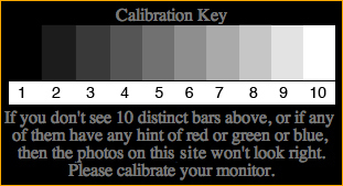
If your system fails the above test, you need to calibrate. Most
operating systems (including Microsoft Windows and Apple’s “Mac OS X”) have built-in calibration
software. These are usually very simple to use, and require no
additional hardware for a basic calibration. The standard Apple
Macintosh calibration program is illustrated below. I used this
program to calibrate my system in under 4 minutes.
Having a properly calibrated
monitor means that you’ll be seeing images on your screen roughly the
way others see them (on average). That’s important for web
distribution, since you don’t want your images to have any systematic
color or brightness biases that will look unpleasant when viewed on
other users’ computer systems. Web distribution of photos is
addressed in Chapter 16.
14.1.3
Sending Photos to
the Lab
If you don’t have a home printer, or do have a home printer but require
higher quality prints, there are two main options for having your
images printed “professionally”. The easiest is to drive to
the nearest WalMart or drug store having an in-store photo kiosk for
making digital prints. For the purposes of printing fine-art bird
photos, this is generally a bad idea. The problem with most
do-it-yourself photo kiosks is that they apply some form of “color correction” to your image before printing
it. Since the vast majority of customers use these kiosks to
print out photos of people, the color “correction” algorithms used by these kiosks
are geared toward rendering skin tones, not toward rendering bird
feathers, and will often result in bird images with an unpleasant color
cast, or unnatural-looking saturation. And despite their lower
quality, prints from these kiosks are often more expensive than those
from mail-in labs. As an example, 8"×10" prints from my local WalMart
kiosks cost me around $5 (US), while the lab I use charges about $2,
and offers free shipping for orders totaling over $12.
A high-quality photo lab will also offer far more
paper and finishing options than the local kiosks. My favorite
lab (WHCC) offers print sizes over 24"×36", on a variety of papers (see
section 14.1.4, below), and with a variety of
texture and lamination
options—so-called finishing
options. Prints can also be mounted to hard substrates such as matboard or masonite (see section 14.1.5,
below), and some labs also offer custom framing and matting (framing
and matting are discussed in section 14.2).
Most pro labs now accept orders via the internet,
which is convenient as long as you have a fast internet
connection. Keep in mind that when making high-quality prints
you’ll need to use a high-resolution version of your image file, not
the low-res version that you’d use when displaying your photos on a web
page. Some labs use custom software that allows you to preview
your image cropped to the relative dimensions of your selected print
size. When making gallery wraps
(see section 14.2), this feature is
particularly useful in seeing which
parts of the image will end up wrapped around the sides of the canvas
frame.
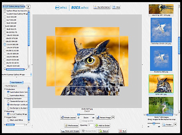
Fig. 14.1.5 :
Custom software used by a pro lab for ordering of prints. In this
case I’m
ordering a gallery wrap (canvas), in which part of the image will wrap
around the sides
of the piece. The software shows where the image will be cropped
or wrapped, and
gives automatic price quotes for selected finishing features, such as
lamination.
I don’t depend on this preview for accurate color information,
though.
In terms of finishing
options, the most important is that of lamination. Most labs offer
the option to have your prints coated with a clear protective
coating. I highly recommend using this option. Laminate
coatings can protect your print both from physical contact (e.g.,
fingerprints) and from the fading effects of ultraviolet (UV)
light. Some coatings also impart a glossy shine to the
image. If you’ll be mounting your print behind glass,
fingerprints are typically less of an issue, as is the added shine from
a glossy coating. However, while some types of mounting glass do
offer UV protection, the cheap framing packages at discount stores
typically don’t, and having the UV coat applied during printing is
typically very inexpensive and therefore worthwhile.
14.1.4
Paper Options
Whether you make your prints at home or send them to a lab, there are a
number of options regarding paper type that you should be aware
of. The two most common options are glossy and matte paper, with the former
obviously imparting an extra “shine” to images than the latter.
In my experience, the difference between glossy and matte paper tends
to largely disappear once the print has been mounted behind glass,
since the glass acts much like a thick gloss coating. The problem
with glossy prints is that they are typically very susceptible to
fingerprints, while matte prints aren’t. Many pro labs offer a
third option, called lustre,
which is usually much more shiny than matte paper, but nearly as
unaffected by fingerprints. For prints made at home, prints on
glossy paper can be given a similar lustre effect via a spray-on laquer
coating; such sprays are available from several companies, including
Krylon and Sureguard, though the application of these sprays may
involve risks to the print if not applied correctly (as well as risks
to your health if used in a poorly ventilated area). The website inkjetart.com is a good resource
for finishing sprays and other products.
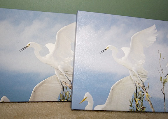
Fig. 14.1.6 :
Two canvases, one with a matte lamination (left), and one with a glossy
lamination (right). I like both, but on different images, due to
artistic considerations.
Note that glossy prints and canvases can be difficult to look at in
certain lighting
configurations, due to glare. While matte prints don’t have this
problem (as much),
for some images the glossy prints just seem more vibrant with the
gloss. For standard
prints (not canvases), semi-gloss is preferable over gloss, due to
fingerprint resistance.
In addition to the glossy/lustre/matte options, some
companies also offer various “premium” grades of paper, though whether
your bird photos will look substantially better when printed on these
is hard to say.
14.1.5
Substrates and
Backing
As mentioned earlier, some pro labs offer the option to have your print
glued to a firm backing. This can be very useful if you intend to
sell your photos at art shows or in local shops, since unframed prints
are easily bent and torn otherwise. For prints that are to be
framed, having them glued to matboard
at the lab may be desirable since it may simplify the framing process,
and also protects against long-term warping of the paper (framing is
discussed in section 14.2). Note,
however, that when you frame
your print you’ll typically be working with a backing substrate that is
sized to the inside dimensions of the frame, whereas the matboard used
by the lab will be sized to the print itself. If the print is
smaller than the mat (see section 14.2), then
an additional backing
substrate will still typically be needed to complete the framing.
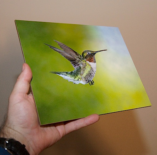
Fig. 14.1.7 : A
masonite print. A standard paper print is glued to a wood
composite substrate, resulting in a firmer and more durable piece for
sale
at art shows and in shops, at a fairly affordable price (about $5 US
more
than the print alone would cost). This masonite is 1/8 inch
thick, but I’ve
seen others up to 1/2 inch with hanging grooves drilled into the back.
For prints to
be sold unframed (and un-matted), two popular options are masonite and styrene. Masonite is a wood
composite, while styrene is a type of plastic. Both are very
rigid, and can’t be easily bent the way standard matboard can. A
relatively new type of matboard, called gatorboard, offers much higher
rigidity than standard matboard, while being lighter than masonite.
Fig. 14.1.8 : A
styrene print. A standard paper print is glued to
a 2mm sheet of styrene plastic, producing a highly affordable
and durable medium for sale at public venues. Some styrene
prints seem to suffer from a small amount of warping, so
the higher cost of masonite may be worth the few extra dollars.
Note that many photographers sell their unframed
prints matted (see section 14.2). This involves
sandwiching the print between a mat (in the
front) and a firm backing (typically matboard) in the back. To
protect the exposed surface of the print prior to sale, it’s a good
idea to enclose the entire assembly in a clear plastic bag or
shrinkwrap. ClearBags
is one such product, though others can be easily found by searching on
the internet. Rolls of plastic film can also be purchased from
your local art supply store (such as Michael’s)
for this purpose; the film is simply cut to size and taped closed
around the matted print, as a low-tech alternative to shrinkwrap.
Note that the plastic wrap that you use in the kitchen is generally
unsuitable for packaging prints, since it can fuse to the exposed
surface of the print and damage it.
14.1.6
Print Size
There are two issues to consider when deciding what paper size to use
for your prints: the optimal print size,
and the aspect ratio.
In terms of the former, there are both technical and artistic
considerations. Artistically, the print size will obviously
affect the overall impact of the piece, and this can be mediated by a
number of factors, including the size of the wall or room in which the
piece is to be displayed, the size of the frame, and even the size of
the subject (e.g., consider that a three-inch hummingbird blown up to
the size of a horse may look somewhat unnatural).
A common problem with making large prints is that
the image’s resolution may not support the desired print size.
Just as zooming in too far onscreen will eventually reveal the actual
pixels making up the image (producing an unpleasant, mosaic effect),
selecting too large a print size can result in prints in which details
appear blurry when seen at normal viewing distances. As a general
rule, the larger the print you intend to make, the more artificial
sharpening you’ll want to apply during postprocessing of the image
(prior to printing) (sharpening in software is discussed in Chapter
11). Too much sharpening can, unfortunately, create artifacts in
the image that over-enlargement will simply make more apparent in the
final print. Although using images from a higher-megapixel camera
may permit larger effective print sizes, higher pixel densities on
CMOS/CCD sensors can also result in more image noise, which again will
be most apparent when making larger prints.
A simple way to preview the amount of detail that
you’d get at a prospective print size is to print the image first onto
smaller paper, but with the “resize image to paper size” option disabled in your printing
software. If you first resize the physical dimensions of your
image to the prospective print size, and then print to a small paper
size without automatic resizing, you’ll be able to see a tiny portion
of the image as it would appear at the final print size. Most
image-processing programs allow this, though not all allow you to
select which part of the image appears on the smaller paper; if
possible, it’s best to arrange for the bird’s face to appear on the
smaller print (but cropped to the larger, virtual print size), since for most
photos you’ll want the bird’s face (or at the very least, the eye) to
appear sharp in the final print.
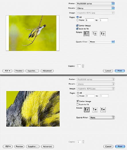
Fig. 14.1.9 :
Spot-checking image sharpness at a target print size.
By first re-sizing an image to the target print size (not shown) and
then
printing on small media (4×6 paper) with
the “Scale to fit” option
disabled,
you can check for sufficient sharpness in key parts of the image before
ordering an expensive print product from the pro lab.
A final issue related to print size is that of aspect ratio. This is the
ratio of the photo’s height to its width (or vice-versa). Most
DSLRs have a roughly 2/3 or 11/16 aspect ratio, or around 0.66 when
expressed as a decimal. In contrast, common paper and print
sizes—such as 8"×10" and 11"×14"—result in a ratio of 0.78 or
0.80, which may be ideal for portraits of human heads, but is less
useful for nature photos (especially landscapes). For bird
photos, a variety of aspect ratios can be useful, depending on the
particular bird and the scene in which it occurs. Note that the
chosen aspect ratio can strongly affect the options for subject framing—i.e., choosing the
relative position of the subject in the image frame (subject framing
was discussed in section 8.1).
Unfortunately, standard photo
papers and pre-made frames and mats are more commonly available in a
0.8 aspect ratio than in 0.66, and customizing sizes of professional
prints and frames typically incurs extra costs.
14.1.7
Longevity
We’ve already addressed some issues related to longevity of prints,
such as the use of UV coatings to protect an image from fading.
It also needs to be noted that some types of inks can last longer than
others. Traditionally, pigment-based inks had better longevity
(though sometimes duller colors) than dye-based inks, though ink
manufacturers continue to make technological innovations which may
affect the expected longevity of either type of ink. Canon’s
newest ink, for example, has a predicted longevity of roughly 100
years. Obviously, since no digital prints have existed for 100
years, it’s impossible to say for certain whether these projected
lifespans for prints made today will prove to be accurate.
|
|
|
