10.4
Visual Qualities
Before you begin applying
specific postprocessing techniques to improve an image, it’ll be useful for you to be
able to quickly assess the image and correctly diagnose its
defects.
Simply observing that “it doesn’t look quite right” doesn’t provide
much guidance in your search for the appropriate corrective
measures. In this section we’ll briefly outline the main
dimensions along which an image can vary: saturation, contrast,
sharpness, brightness, and color balance. Once you have a firm
grasp of these concepts and begin to accumulate some experience in
assessing where each image lies along these various dimensions, you’ll
start to
get more efficient at figuring out what postprocessing effects need
to be applied to each image to improve its overall aesthetics.
10.4.1
Saturation
The term saturation refers to
the overall color richness of
an image. There are a number of different technical definitions
of saturation, but they’re not important here. What is important is that saturation is
a highly subective quality that can nevertheless strongly impact
whether and how much the average viewer enjoys your photos.
Indeed, assessing—and therefore adjusting—saturation is one of the most
difficult tasks in digital nature photography. Most beginners
tend to oversaturate. After some time they realize that they’ve
been oversaturating their images and will sometimes overcompensate by undersaturating everything.
Meanwhile, other people viewing their images via the internet will be
seeing the same images but with slightly different saturation levels,
due to differences in the rendering hardware (and software) between
their own computers and that used by the photographer. Then there
is the overall cultural drift in terms of what is currently considered
stylish (with regards to color richness), versus “retro” or simply outdated. It is,
in a word, frustrating.
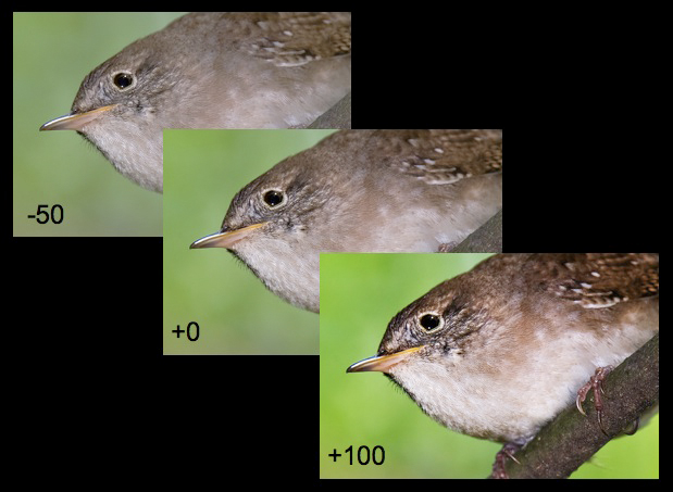
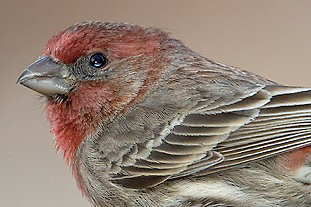
Let’s consider an example. In the figure
below, the middle image (labeled “+0”) is the original, which hasn’t
been subjected to any saturation adjustments. The bottom row in
the figure shows the image after increasing the saturation by various
amounts (+25, +50, and +100) in Photoshop. Increasing the
saturation obviously brings out more of the latent colors in the photo,
resulting in a more striking image. Viewers’ eyes are often drawn
to the most intensely colorful images on a page, though this doesn’t
mean that they’ll necessarily find that image more aesthetically
pleasing than less saturated versions of the same photo. In this
example the +100 image is obviously useless for aesthetic
purposes. At this resolution the +50 image may appear
over-saturated as well, depending on tastes (I, for example, think it
looks hideous). For the +25 image the verdict is less
clear. Moving to the top row of the figure, the -100 cell is
again clearly useless as a color photograph (all of the color has been
removed, resulting in a grayscale image), and the -50 image clearly
seems flat. The -25 is closer to the original; the beak is a bit
less yellow and the background is also slightly less green.
Fig.
10.4.1: Saturation. Adjusting the “saturation” slider in
Photoshop’s Hue/
Saturation tool results in changes in color richness. The
original image is shown
in the middle (+0 saturation). Decreasing the saturation (top
row)
moves the image
progressively toward grayscale. Increasing saturation (bottom
row) improves color
richness but makes the image look increasingly artificial and
unpleasant.
It’s important to note that this example is limited
in its illustrative power by the low resolution of the images shown
here. At normal resolutions, saturation adjustments of -25 or +25
would typically be far too extreme (though there are exceptions to
every rule). Personally, I rarely increase saturation at all
(directly, via the Saturation slider in Photoshop), and when I do it’s
never by more than +5. The problem with increasing saturation by
more than this amount is that experienced viewers of digital art
quickly notice the unnaturally elevated saturation and conclude that
the photo has been “over-processed”.
Ideal saturation levels are highly subjective.
Keep in mind also that different computer monitors render images with
different amounts of saturation, so what looks good on your screen
might not look as good on your neighbor’s. This is why I
recommend leaving the saturation neutral—i.e., as it looks straight
out-of-the-camera—when processing images for display on the
internet. For for making photographic prints (section 14.1),
especially canvases, I instead recommend trying different saturation
levels on smaller trial prints to find the best setting for your
particular printing device.
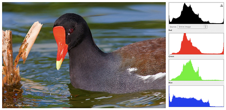
Fig.
10.4.2: Over-saturation can cause clipping in some channels and not
others.
In this example, the red of the bird’s facial shield and beak has been
over-
saturated, resulting in an obvious lack of detail. The red
component of the
histogram reveals the clipping that has occurred at the right.
Increasing the
saturation of an image artificially also poses the risk of clipping
individual color channels. As described previously (sections 6.2, 10.2), clipping the
image
histogram—at either end—is generally bad
because it can result in loss of detail as fine differences in pixel
intensity are obliterated by mapping those pixels to the same
hue. The same thing can occur in individual color channels (i.e.,
red, green, blue), resulting in loss of detail in regions of an image
having nearly a solid color. In the gallinule image above, notice
that the red portion of the beak and facial shield is relatively devoid
of fine-scale details. In the accompanying panel of histograms,
notice that the red channel shows clipping at the right end—i.e., an
interrupted peak at the edge of the graph—likely accounting for the
lack of detail in the intense red of the bird’s beak. This was a
direct result of globally increasing the saturation of the entire
image: because global changes affect all colors equally, any color
already over-represented in the image (even locally) can be pushed to
the point of clipping and therefore loss of detail.
Note that the
Hue/Saturation tool isn’t the only way to alter the saturation of an
image in Photoshop. I’ve found that the Levels and Curves tools
also increase apparent saturation in some circumstances, and I
sometimes end up needing to decrease saturation a bit using the
Hue/Saturation tool after using Levels or Curves. Also be aware
that in Photoshop’s RAW conversion window (called Adobe Camera Raw, or ACR), which opens automatically
when you open a RAW file in Photoshop, there is a slider called Vibrance which allows more subtle
adjustments to saturation than does the actual Saturation slider.
Whereas the Saturation slider increases the intensity of all colors in
the image equally, Vibrance preferentially boosts those pixels that are
least saturated, and can be used to rectify undersaturation problems
without as much risk of clipping. As we’ll see in section 10.6,
another option is to selectively increase saturation in just those
regions of an image that obviously need it, using Photoshop’s selection tools.
10.4.2
Color Balance
One concept you’ll encounter a lot more in other books on photography
than in this one is color balance,
or white balance. These
terms refer to the color cast that results from a light source having a
non-neutral color temperature
(section 7.1). For indoor photography,
artificial white-balance
correction is typically essential, as artificial lights often produce a
color bias that looks unpleasant in digital stills. For outdoor
nature photography, color temperature is still a relevant issue, since
natural light can indeed assume a wide range of temperatures.
However, to the extent that natural lighting effects are deemed
integral to the mood of the scene being captured, “correction” of white balance in these cases
will generally be less desirable.
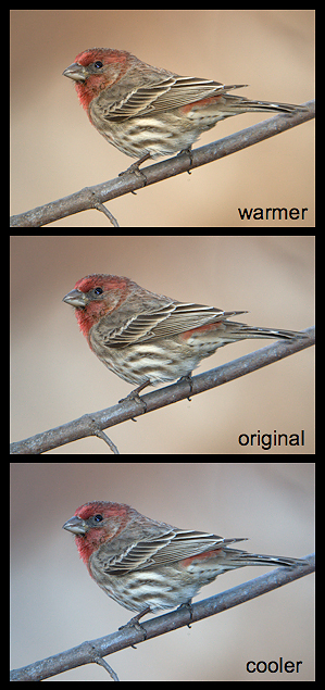
Fig. 10.4.3:
The effect of color temperature.
Middle image: original photo. Top: after
adjusting the white balance to make the
image appear “warmer”. Bottom:
after
adjusting the white balance to make the
image appear “cooler”.
Personally, I almost never adjust color balance in my images. I
simply
shoot in RAW with auto-white balance (AWB), and leave the default
settings in place during RAW conversion. If an image has a
reddish
cast because it was taken with the setting sun behind me, I rely on my
viewers to correctly interpret that cast as indicating the time of day
at which the scene was captured. My attempts in the past to
correct color casts have generally been unsuccessful, so when I
encounter an image during filtering
(chapter 12) that has a noticeable, unpleasant cast, I generally skip
it and move on to another image.
Note that the perception of color cast can be
significantly affected by viewing conditions—i.e., the monitor used to
view the images, and even the light bulbs used in the room where you do
your image processing. Many home lamps produce light with a
yellow bias (3000-4000°K), either due
to the light bulb alone, or to the bulb in combination with a lamp
shade. By imposing a color cast on everything else in the room,
home lighting can strongly affect your perception of the color balance
in images rendered on an electronic display, sometimes resulting in
perception of a color cast opposite that imposed by the lighting (i.e.,
seemingly bluish). You can now buy light bulbs with a more
neutral color temperature (~5500°K), though the effect of any lamp
shade and even wall paint may confound any neutrality in the bulb’s
output. Monitor calibration is another important consideration in
this context (section 14.1.2).
10.4.3
Contrast
After saturation, the next most striking aspect of an image—in terms of
sheer ability to attract attention—may well be its contrast. As with images that
have been over-saturated in postprocess, photos with excessive contrast
need not be aesthetically pleasing to attract attention. The
trick is to find a tasteful
degree of contrast that will both attract the eye and avoid the
appearance of artificial manipulation.
Contrast is a very general term. In Photoshop
and similar programs, adjustments to contrast generally result in
increasing the differences between the extremes—e.g., whiter whites and
blacker blacks, as well as greener greens and redder reds, etc.
In the figure below, we show the original image in the middle (labeled “+0”) along with an image artificially
depleted for contrast (-50) and one artificially enriched in contrast
(+100).
Fig. 10.4.4:
Contrast. Increasing the contrast results in brightening
the brighter areas and darkening the darker areas. Increasing
contrast via the Brightness/Contrast window in Photoshop often
produces unpleasant results. Other methods for increasing
contrast include the Levels and Curves tools. Decreasing
contrast via Brightness/Contrast can sometimes be useful.
Notice that contrast to some
degree subsumes saturation. In the figure above, the saturation
of the green background and the yellow in the bird’s beak follows
differences in the contrast. The most striking aspects of
contrast manipulation, however, tend to be seen in the white and black
features in an image. Artificially increasing the contrast tends
to quickly clip the histogram at both ends (or at least to conflate
pixel values near the extremes), resulting in lack of detail in both
bright and dark areas of an image. Decreasing the contrast, on
the other hand, tends to have more of a benign effect, and can
sometimes result in more natural-looking images.
Contrast is very often confused with sharpness (section 10.4.5), and for
good reason, since sharpness is often defined in terms of fine-scale
contrast of minute features in a subject. In terms of
postprocessing of bird images in Photoshop, I rarely ever use the
Contrast slider in Photoshop (via the Brightness/Contrast
window). Instead, I prefer to directly manipulate the variables
influencing perceived contrast, via the Levels tool and (more rarely)
the Curves tool. These tools adjust the global contrast of the photo.
More local changes to contrast can be achieved via direct selection of
regions to manipulate (section 10.6). At
the most local scale,
artificial sharpening increases micro-contrast (section 4.3) on
individual foreground features such as feather barbs and other
anatomical details.
10.4.4
Brightness
Brightness is probably the simplest and most easily quantifiable image
quality, though there are some subtleties worth briefly exploring
here. You’ll recall from section 10.2
that in an 8-bit image
(such as a JPEG), each pixel component varies in numerical value from 0
to 255, with 0 denoting pure black and 255 pure white. Brightness
thus refers to the average pixel intensity, in terms of numerical pixel
values, with higher average pixel values resulting in an overall
brighter image.
As illustrated by the figure below, even subtle
modifications to overall brightness can result in noticeable
differences in apparent detail, contrast, and even saturation.
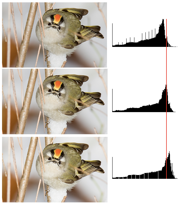
Fig. 10.4.5:
Increasing or decreasing brightness can have secondary
effects, since brightness affects contrast and saturation.
Middle: the
original image. Top: after decreasing brightness artificially in
Photoshop. Bottom: after increasing brightness. Notice that
changes to brightness affect the histogram by shifting its mass
left or right, and can also fragment portions of it.
In the top image of the figure above, the brightness has been decreased
by a value of -10 in Photoshop. Looking at the snow beneath the
bird and the white throat feathers, this seems (on my monitor, at
least) to have increased the apparent level of detail in those regions
of the image. The increased detail is due to an increase in
contrast resulting from the stretching of the histogram between the
main peak and the rightmost end. As you can see, this also
resulted in some fragmentation of the right tail of the distribution,
which in extreme cases can result in posterization (section 10.2). In the bottom image
we’ve instead increased
brightness, and this has
resulted in less contrast and detail in the snow, while also slightly
fragmenting the left tail of
the distribution.
Now let’s compare the bird’s head patch between the
top and bottom images. Notice that increasing the brightness has
also changed the colors, resulting in less red and more yellow.
This resulted from the fact that increasing the brightness shifts the
histogram to the right; for an already bright image, this causes the
individual color channels to be crowded together at the right end of
the histogram, where they’re forced to overlap more, resulting in more
color blending and therefore less prominence of individual pure colors
in bright areas. This is analogous to what happens when you
experience feather glare in bright shooting conditions: too much light
striking the subject overwhelms the feathers’ ability to selectively
absorb some parts of the visible spectrum, resulting in pure white
(full-spectrum) light being reflected. Just remember that
brightness, contrast, and saturation are not entirely independent, and
that all of them derive from relative pixel intensities.
As with other visual qualities, the apparent
brightness of an image can be affected by viewing conditions, including
the inherent brightness of your monitor (computer screen) as well as
the lighting in your home. I prefer to do my postprocessing in a
room with fairly dim lighting; overly bright lighting tends to make me
increase the brightness and contrast of my images to compete with the
ambient light in the room, whereas working in a pitch black room with
no lights causes the brightness from my screen to overwhelm my eyes and
tire them faster.
10.4.5
Sharpness
Sharpness—the perception that a photo contains a high degree of
detail—is simultaneously one of the most critical aspects of bird
photos and one of the most difficult to objectively assess. As
with saturation, many beginners tend to over-sharpen their images, and
ideal sharpness levels can certainly be somewhat subjective.
Let’s again forego any technical definitions and instead consider a few
examples.
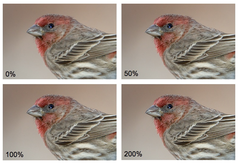
Fig. 10.4.6:
Sharpness. From the original, unsharpened image (labeled 0%),
through 200% increase in sharpness at a 0.15 radius and 0
threshold. Any
camera with an antialiasing filter over its sensor requires at least
some amount
of sharpening in postprocess. Finding the perfect amount of
sharpening for each
photo is one of the most difficult tasks in postprocessing.
The four images
shown above were subjected to different amounts of artificial
sharpening in Photoshop. To some (perhaps many) eyes, the 0%
version will appear less than ideal, while different viewers will
likely choose differently from among the other three images in
identifying what looks best to them. Certainly, the 200% version
gives the impression of the greatest amount of fine-scaled detail, and
would probably be called by most the “sharpest”. Whether most people would
find this one the most pleasing among the four images less
obvious. Personally, I find the 100% and 200% versions to be
reasonably acceptable to my eyes, while the image in the figure below
(Fig 10.4.7) is, in my opinion, a prime example of blatant
over-sharpening. The image certainly contains a large amount of
detail, but those details have been so exaggerated that the image looks
plainly artificial.
Fig. 10.4.7:
A case of blatant oversharpening.
Though this image reveals many fine details
in the subject, there are numerous artifacts
introduced as a result of overly aggressive
use of artificial sharpening in software.
The problem with this image isn’t the amount of
detail that it shows: there’s nothing wrong with an image that really
is extremely sharp (e.g., due to the use of top-quality photography
gear and impeccable technique). Rather, over-sharpening refers to the use
of artificial sharpening to increase sharpness beyond what the captured
image can support. All digital photos need to be artificially
sharpened in postprocess to alleviate the blurring effect of the
antialiasing filter that covers the imaging sensor in (most) DSLR
cameras. You can think of artificial sharpening as a process of
reclaiming sharpness lost due to the antialiasing filter.
Over-sharpening occurs when that artificial sharpening process attempts
to increase sharpness beyond what the image can support.
Over-sharpening creates the illusion of image detail which isn’t
actually present in the image; unfortunately, that illusion doesn’t
fool everyone. For savvy internet users, who’ve seen many
thousands of digital images of widely varying quality, over-sharpened
images stand out like a sore thumb. The case of the image above,
one indicator of over-sharpening is the presence of isolated bright
pixels (look in the gray feathers on the bird’s shoulder and breast);
these result from the sharpening algorithm’s attempt to increase
fine-scale contrast. If you enlarge an over-sharpened image to a
high zoom level (1000% or so), you’ll sometime see halos—rings of bright pixels around dark
features—that are introduced by the
sharpening algorithm. These types of artifacts are a sure
indication of over-sharpening, though even without any of these obvious
signs an image can still be considered over-sharpened if it offends
your (or someone else's) sense of what level of sharpening “looks good”.
Keep in mind that ideal sharpness is
medium-dependent. Just as with saturation, the only way to know
how a printed image will look with a certain level of artificial
sharpening is to print it and see. Variability between computer
monitors is less of an issue with sharpening than it is for saturation,
though some monitors are certainly capable of rendering images with
greater contrast than others, and those with a large color gamut, or a
different pixel pitch, may indeed reveal more details to viewers than
others, thereby affecting the perception of sharpness.
|